The ggplot2 is one of the popular plotting libraries that one could leverage to get beautiful publication-ready plots. The problem arises when you want to combine your multiple plots together.
You may want to combine multiple plots to illustrate comparisons or to display information in an aggregated manner.
Article Outline
- Aim of this article
- Generating Plots
- Combining using grid package
- Combining using gridExtra package
- Combining using ggpubr package
- Combining using patchwork package
Aim
In this article, we will learn how we could leverage different R’s libraries to combine multiple ggplot2 plots.
Observing Dataset
In this article, we are going to use the inbuilt in mtcars dataset. You can see the first 6 observations using the head( ) function.
head(mtcars)
Data Background
The data was extracted from the 1974 Motor Trend US magazine, and comprises fuel consumption and 10 aspects of automobile design and performance for 32 automobiles (1973–74 models) [1].
The data frame contains 32 observations on 11 (numeric) variables.
- mpg: Miles/(US) gallon
- cyl: Number of cylinders
- disp: Displacement (cu. in.)
- hp: Gross Horsepower
- drat: Rear axle ratio
- wt: Weight (1000 lbs)
- qsec: 1/4 mile time
- vs: Engine (0: V-shaped, 1: straight)
- am: Transmission (0: automatic, 1: manual)
- gear: Number of forward gears
- carb: Number of carburetors
Structure of mtcars data
Let’s see the data type of each columns using glimpse( ) function from tidyverse package. The tidyverse package contains the base ggplot2 (used for plotting) and dplyr (used for data manipulation) packages.
glimpse(mtcars)
Loading Relevant Libraries
The very next step is to load the relevant libraries using library( ) function. You need to install these libraries first using install.packages( ) function.
library(tidyverse) # plotting and manipulation
library(grid)      # combining plots
library(gridExtra) # combining plots
library(ggpubr)    # combining plots
library(patchwork) # combining plots
Checking class (data type)
Here, we are going to use the gear and am variables which are of numeric type. You can check the type using class( ) function.
class(mtcars$gear)
class(mtcars$am)
Converting to categorical variable
For plotting, we need to convert both gear and am to categorical variables using as.factor( ) function as both contain few distinct categories.
mtcars$gear <- as.factor(mtcars$gear)
mtcars$am <- as.factor(mtcars$am)

class(mtcars$gear)
class(mtcars$am)
Preparing plots
To demonstrate how we could combine plots, first, we need to generate a few plots. This plot can be any plot like bar, scatter, box, line etc.
Plot1: Scatter plot
The first plot is a scatter plot where we are going to plot wt on x-axis and mpg on the y-axis and colouring the points based on gear (categorical variable).
plot1 <- ggplot(data = mtcars, mapping = aes(x = wt, y = mpg,
                                             colour = gear)) +
  geom_point(size=3) +
  ggtitle("plot1")

plot1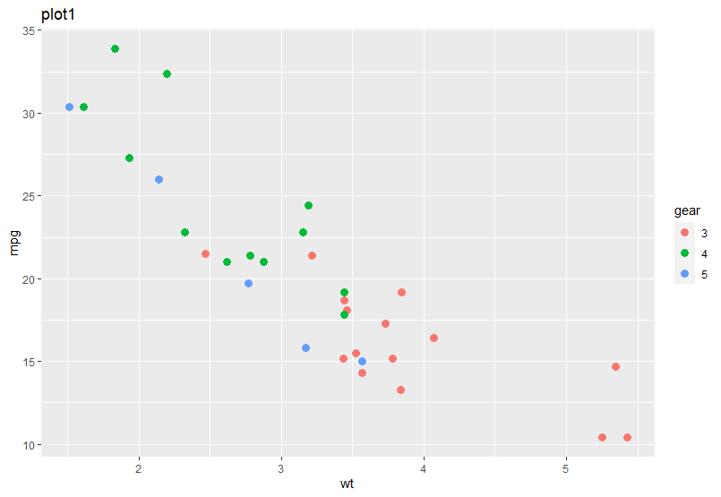
Plot2: Histogram plot
The second plot is a histogram, where we plot the distribution of mpg variable.
plot2 <- ggplot(data = mtcars, mapping = aes(x = mpg)) +
  geom_histogram(binwidth = 5) +
  ggtitle("plot2")

plot2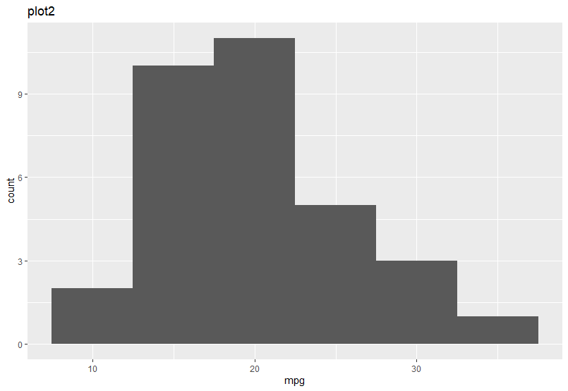
Plot3: Box plot
The third plot is a box plot, wherein the x-axis we plot the interaction of gear and am and in the y-axis, we plot the mpg values.
plot3 <- ggplot(data = mtcars,
                mapping = aes(x = interaction(gear,am), y=mpg)) +
  geom_boxplot() +
  ggtitle("plot3")

plot3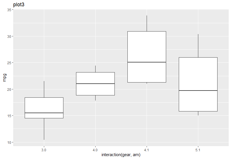
Plot4: Line plot
The fourth (last) plot is a line plot, where we plot hp in the x-axis and mpg in the y-axis.
plot4 <- ggplot(data = mtcars, mapping = aes(x = hp, y=mpg)) +
  geom_line() +
  ggtitle("plot4")

plot4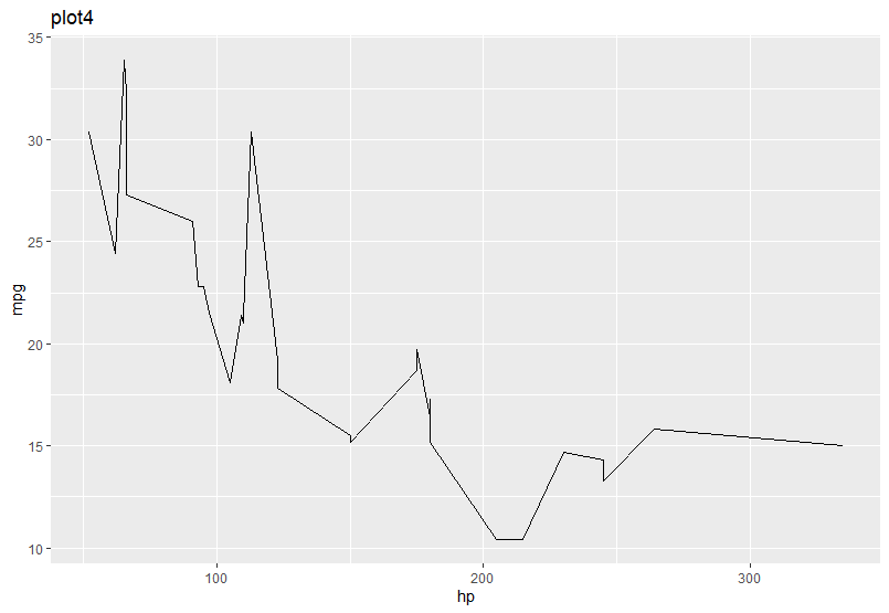
Combining plots using gird library
First, we are going to use the grid library to combine the four plots (plot1, plot2, plot3 and plot4).
- First, we need to create an empty page using grid.newpage( ) function
- Second, we need to use the pushViewport( ) function to push the layout using the viewport( ) function. Here, we have pushed a 2 by 2 layout, means 2 rows and 2 columns for our four plots.
# Create a new page
grid.newpage()

# Next push the vissible area with a layout of 2 columns and 2 row using pushViewport()

pushViewport(viewport(layout = grid.layout(2,2)))
Once you establish the layout, the next step is to send your plots inside the layout using viewport( ) function and inside that, you have to provide the plot object and define its row and column position. Once you push all the defined plots inside your layout it will generate the following combined plot.
# Put the plot on the the area by row and column position

print(plot1, vp = viewport(layout.pos.row = 1, layout.pos.col = 1))
print(plot2, vp = viewport(layout.pos.row = 1, layout.pos.col = 2))
print(plot3, vp = viewport(layout.pos.row = 2, layout.pos.col = 1))
print(plot4, vp = viewport(layout.pos.row = 2, layout.pos.col = 2))
Combining plots using gridExtra library
The next library is gridExtra, which is very simple to use. After loading this library, you need to use the grid.arrange( ) function and inside that, you have to provide the plots one by one, as per the order in which you want to plot it. Further, you need to define the number of rows and columns you want.
grid.arrange(plot1, plot2, plot3, plot4, nrow = 2, ncol = 2)
You can change the order of the plots by changing the order of the plot objects inside the grid.arrange( ) function. Here, is an example, where I have changed the order of plot objects (plot3, plot2, plot4, plot1).
# Changing the order
grid.arrange(plot3, plot2, plot4, plot1, nrow = 2, ncol = 2)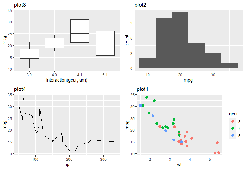
Combining plots using ggpubr library
The next library is one of the popular libraries used for scientific publication, known as ggpubr. The combining mechanism is same as gridExtra library.
figure <- ggarrange(plot1, plot2, plot3, plot4,
                    ncol = 2, nrow = 2)
figure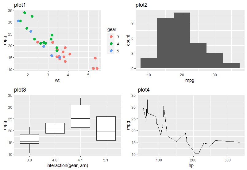
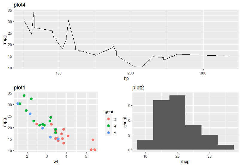
You can arrange the plots by nesting the ggarange( ) function in the position of plot objects. Here, I have first plotted object plot4 (extending the entire column width of the first row) and another ggarrange( ) object in second plot position, which comprised of plot1 and plot2.
ggarrange(
  plot4,    # plot4 in first row
  ggarrange(plot1, plot2, ncol = 2),
  nrow = 2  # plot1 and plot2 in second row
)
Combining plots using patchwork library
The fourth library known as patchwork makes the combining process very simple. After loading the library, you can just use mathematical notations for combining multiple plots. Here, I have combined plot1 and plot2 with just an addition (+) sign.
plot1 + plot2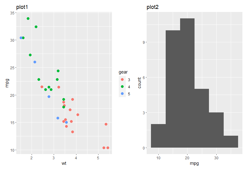
Let’s say, you want to plot plot1, plot2 and plot3 in row 1 and plot4 in row 2. You can achieve this by providing the plot objects inside a bracket ( ) separated with OR (|) operator. You can use the divide (/) operator to indicate that plot4 should be in next row.
(plot1 | plot2 | plot3) /
  plot4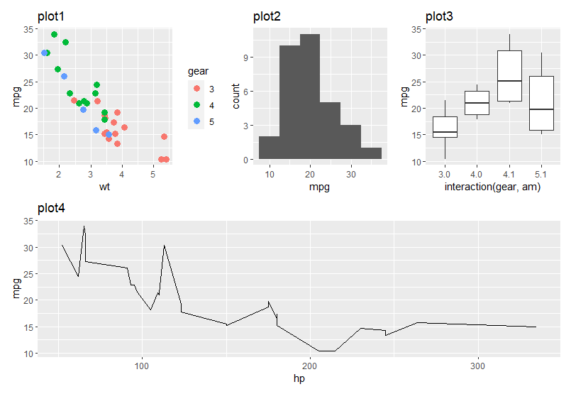
I hope you learned something new. See you next time!
References
[1] Henderson and Velleman (1981), Building multiple regression models interactively. Biometrics, 37, 391–411.


