Rahul Raoniar
- posted on
- Comments Off on Introduction to Dodged Bar Plot (with Numerical Stats)— Python Visualization Guide (Part 2.3)

Introduction
A dodged bar plot is used to compare a numerical statistics across one or more groups. In the earlier blog, we used it to compare categorical counts or relative proportions. Here in this blog we will be generating similar plot but to compare statistics such as mean.
In the current article, we will deal with mean-based bars, where we will be comparing the day wise mean tip across gender.
Article outline
The current article will cover the following:

Objective: Generating a barplot that represent the mean tip for each day by sex category
The objective of the current plot is to generate a dodged bar plot with numerical statistics. Here we will be comparing the day wise mean tip across gender. We will generate the following plot using pandas and seaborn.

Loading libraries
The first step is to load the required libraries.
import numpy as np
import pandas as pd
import matplotlib.pyplot as plt
import seaborn as sns
Basic knowledge of matplotlib’s subplots and dodged plot
If you have basic knowledge of matplotlib’s subplots( ) method, you can proceed with the article, else I will highly recommend reading the first two blogs on this visualisation guide series.
Introduction to Line Plot — Matplotlib, Pandas and Seaborn Visualization Guide (Part 1)
Also read the second blog to familiarize with bar plots.
Introduction to Dodged Bar Plot — Matplotlib, Pandas and Seaborn Visualization Guide (Part 2.1)
For the current plot, we are going to use tips dataset.
Source:
Bryant, P. G. and Smith, M. A. (1995), Practical Data Analysis: Case Studies in Business Statistics, Richard D. Irwin Publishing, Homewood, IL.
The Tips dataset contains 244 observations and 7 variables (excluding the index). The variables descriptions are as follows:
bill: Total bill (cost of the meal), including tax, in US dollars
tip: Tip (gratuity) in US dollars
sex: Sex of person paying for the meal (Male, Female)
smoker: Presence of smoker at a party? (No, Yes)
weekday: day of the week (Saturday, Sunday, Thursday, and Friday)
time: time of day (Dinner/Lunch)
size: the size of the party
Reading tips dataset
Let’s load the tips dataset using pandas read_csv( ) method and print the first 4 observations using head() method.
tips = pd.read_csv("datasets/tips.csv")
tips.head(2)
Calculating aggregating mean tip by day and sex
To generate this dodged plot, we need to compute the mean tip for each day for each gender group. To achieve this, we have to go through the following steps:
Step 1: apply the groupby( ) method and group the data based on ‘day’ and ‘sex’ and select the ‘tip’ column from each group.
Step 2: Then apply the aggregate method agg( ) and supply mean.
Step 3: Apply unstack( ) method so that the day labels will be presented in index and sex labels in columns, and mean tip values will be in cells.
Step 4: Save the output into df variable.
df = (tips
      .groupby(["day", "sex"])["tip"]
      .agg("mean")
      .unstack()
      .round(2))
df
Plotting using DataFrame [Pandas DataFrame style]
To achieve this using Pandas, we need to go through the following steps:
Step 1: instantiate the subplots( ) method with 10 inch width and 5 inch height and save the figure and axes objects to fig and ax respectively.
Step 2: Next, apply plot( ) method on the DataFrame (df) object. Specify the kind = “bar” and ax = ax, color = [‘blue’, ‘green’]and edgecolor = “black”.
fig, ax = plt.subplots(figsize = (10, 5))
df.plot(kind = "bar",
        ax = ax,
        color = ['blue', 'green'],
        edgecolor = "black")
Bam! We now have the initial framework for the final plot.
Adding labels on bars
Now let’s move on to one of the important topic in bar plots called patch. Every rectangle you see in the barplot known as patch object which contains numerous information like height of the bar, width, their x and y position, colour etc. Let’s check, how many patch objects the axes (ax) object contains.
The ax.patches prints that the barplot contains 8 patches/rectangles.
# Printing axes patch objects
ax.patches
<Axes.ArtistList of 8 patches>
Let’s iterate though each patch object using a for loop and print it. The output shows each patch/rectangle object contains it’s x, y position, width of the bar, height,and angle information.
# Printing patch items
for i in range(len(ax.patches)):
    print(ax.patches[i])
Rectangle(xy=(-0.25, 0), width=0.25, height=2.78, angle=0)
Rectangle(xy=(0.75, 0), width=0.25, height=2.8, angle=0)
Rectangle(xy=(1.75, 0), width=0.25, height=3.37, angle=0)
Rectangle(xy=(2.75, 0), width=0.25, height=2.58, angle=0)
Rectangle(xy=(0, 0), width=0.25, height=2.69, angle=0)
Rectangle(xy=(1, 0), width=0.25, height=3.08, angle=0)
Rectangle(xy=(2, 0), width=0.25, height=3.22, angle=0)
Rectangle(xy=(3, 0), width=0.25, height=2.98, angle=0)
Plot Customisation
Let’s customise the plots by adding bar labels, removing spines, adding axes and tick labels, and customising the legend.
Annotating bar labels
As we now know that patch object contains x position, y position and height information. Thus, we can iterate through each patch object and retrieve this information and add them to bars.
For annotating bar labels, we need to follow the following steps:
Step 1: Loop through each patch objects (ax.patches) and save it to a temporary variable ‘p’.
Step 2: use ax.annotate( ) method to annotate the labels.
- The first argument it takes as the value that we want to add as a bar label. We can retrieve the information (i.e., height) using get_height( ) and convert it to a string object using str( ) to add a percentage (%) symbol.
- Next, we need to supply the x and y coordinates. It can be retrieved using get_x( ) and get_height( ) method. To improve the positioning of the data labels at the top of the bars, we have added some padding of 0.02 (in the x-direction) and 0.1 (in the y-direction). Next, we save it to a temporary variable ‘t’.
Step 3: Next, we used the set( ) method to change the annotated text properties like color and size.
Removing Spines
To remove the top and right side spines, use a for loop to iterate through each spines ax.spines[position] and apply set_visible() to False.
Customising labels
Next, we can alter the axes and tick labels to make it more informative.
- Use ax.set_ylabel( ) method to change the ylabel.
- Next, use the ax.xaxis.label.set() and ax.yaxis.label.set() to set the size of the x-axis and y-axis labels.
- The tick parameters properties can be altered using ax.tick_params( ) method.
Customising legend
Next, we need to add some identifiers for the bars using legend. Here, we used the ax.legend( ) method to set the location to center, fontsize to 14, legend title as “Gender”, and set its size to 16.
# Annotate data labels
for p in ax.patches:
    t = ax.annotate(str(p.get_height()), (p.get_x() + 0.02, p.get_height() + 0.1))
    t.set(color = "black", size = 12)
# Remove spines
spines_off = ["top", "right"]
for s in spines_off:
      ax.spines[s].set_visible(False)
# Adding labels
ax.set_ylabel("Mean Tip")
ax.tick_params(labelsize = 14, labelrotation = 0)
ax.xaxis.label.set(size=16)
ax.yaxis.label.set(size=16)
# Customising legend
ax.legend(loc = "center",
          fontsize = 14,
          title = 'Gender',
          title_fontsize = 16)
fig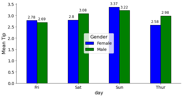
Adding more information
Now we will add some additional information that will help us to compare the average tip per day across gender.
Here we will add an overall mean tip line to compare each day’s mean tip. Question: Which day the daily average tip, across gender, was above the overall mean tip?
Adding a horizontal line
To answer this question, we need to add an overall mean tip line. To achieve this, we used the ax.axhline( ) method. Further, we set line height (y) as the mean of the overall tips, colorof the line set to red, linestyle was set to “dashed” and opacity set to 0.3.
Adding text
Next, we have added the overall tip’s mean value over the line using Text( ) method imported from matplotlib. It takes x and y coordinates of the position where we would like to add the text and the text information. Here, we set the mean tips text using fstring, set the color to red and save it to a variable called text. Next, we add this text info. on the axes (ax) object using _add_text( ) method.
Changing legend box shape and position
To improve the plot, we can further customise the legend properties.
- First we will set the legend box style to round using ax.legend_.legendPatch.set_boxstyle( ) method by supplying the shape to be round, padding of 0.5 and rounding radius size to 2.
- Next, we will set the legend patch face color to “white” using ax.legend_.legendPatch.set_facecolor(“white”)
- Lastly, we fixed the legend position using ax.legend_.set_bbox_to_anchor( ) method.
Answer: The final plot revealed that male customers paid a mean tip higher than the overall mean tip (grand mean tip) on Saturdays and Sundays. While, female paid higher than mean tip only on Sundays (which was also the highest average tip paid in any given day).
# Adding a horizontal line
ax.axhline(y = tips.tip.mean(), color = "red", linestyle = "dashed", alpha = 0.3)

# Adding text in plot
from matplotlib.text import Text
text = Text(x = 0.3, y = tips.tip.mean() + 0.1, text = f"Mean Tip: ${round(tips.tip.mean(), 3)}", color="red")
ax._add_text(text)

# Fixing legend box shape and position
ax.legend_.legendPatch.set_boxstyle("round, pad = 0.5, rounding_size = 2")
ax.legend_.legendPatch.set_facecolor("white")
ax.legend_.set_bbox_to_anchor([0.5, 0.3])
figSaving the final plot
To save the plot, we need to call the savefig( ) method from fig object. In addition to that, here we have used a try and except clause.
try: it will look for the “images” directory and if it does not exist, then it generates a new one.
except: This clause will execute if the “images” directory already exists.
Once the try and except clause executed, it will execute the fig.savefig( ) method and save the plot.
- In the savefig( ) method we provided the image name and its extension like .png, .jpg etc. and supplied 300 dpi value.
import os
try:
    os.mkdir('images')
except:
    print('Image dir already exist!')
fig.savefig("images/meanbarplot.png", dpi = 300)
Plot using DataFrame [seaborn style]
Next we will be adopting Seaborn’s way of achieving the same plot. In the seaborn approach, we only need the Data Frame, and it doesn’t require any transformation like we did for dataframe-based approach.
tips.head(5)
For seaborn approach, we need to go through the following steps:
- Use the subplots method and save the returned objects to figure (fig) and axes (ax)
- Use barplot( ) method from seaboran. Further, provide ‘day’ column on the x-axis, ‘tip’ on the y-axis, ‘sex’ on the hue, data = tips, and ax = ax arguments.
- Next, supply the estimator argument, which will be here mean (using np.mean). Further, turn off the confidence intervals (ci = False).
- Order the days starting from Friday and use pallets of blue and green.
fig, ax = plt.subplots(figsize = (10, 5))
sns.barplot(x = "day",
            y = "tip",
            hue = "sex",
            data = tips,
            ax = ax,
            estimator = np.mean,
            ci = False,
            order = ["Fri", "Sat", "Sun", "Thur"],
            palette = ["blue", "green"])
The code for data labels annotation, spines removal, addition of axes and tick labels, legend customisation, and mean line are exactly the same.
# Annotating data labels
for p in ax.patches:
    p.set_edgecolor("black") # additional
    t = ax.annotate(str(p.get_height().round(2)), (p.get_x() + 0.07, p.get_height() + 0.1))
    t.set(color = "black", size = 12)
#################################################
# Same from here
#################################################
# Removing spines
spines_off = ["top", "right"]
for s in spines_off:
      ax.spines[s].set_visible(False)
# Adding labels
ax.set_ylabel("Mean Tip")
ax.tick_params(labelsize = 14, labelrotation = 0)
ax.xaxis.label.set(size=16)
ax.yaxis.label.set(size=16)
# Customising legend
ax.legend(loc = "center",
          fontsize = 14,
          title = 'Gender',
          title_fontsize = 16)
# Adding a horizontal line
ax.axhline(y = tips.tip.mean(), color = "red", linestyle = "dashed", alpha = 0.3)
# Adding text in plot
from matplotlib.text import Text
text = Text(x = 0.1, y = tips.tip.mean() + 0.1, text = f"Mean Tip: ${round(tips.tip.mean(),3)}", color="red")
ax._add_text(text)
# Fixing legend box shape and position
ax.legend_.legendPatch.set_boxstyle("round, pad = 0.5, rounding_size = 2")
ax.legend_.legendPatch.set_facecolor("white")
ax.legend_.set_bbox_to_anchor([0.5, 0.3])
fig
I hope you now know how to generate a barplot. Similar to mean you can also compare other statistics like median, mode, frequency etc.
There are endless ways of customising a plot using matplotlib library. Try all these on your collected data.
References:
Click here for the data and code
I hope you learned something new! 😃
If you learned something new and liked this article, share it with your friends and colleagues.