Rahul Raoniar
- posted on
- Comments Off on Introduction to Box and Boxen Plots — Matplotlib, Pandas and Seaborn Visualization Guide (Part 3)

Introduction
In this blog, we will learn how to generate box plots and boxen/letter value plots using matplotlib and seaborn. Box plots are useful for checking the data distribution of a numerical variable across different categories of a categorical variable.
Article Outline
The current article comprised of the following:

What is a boxplot?
A box plot provides a five-numbered statistical summary, which delivers valuable information for understanding the existing variables. The five number summary comprised of Minimum, First Quartile (Q1), 2nd Quartile (Q2) or median, Third Quartile (Q3) and Maximum. The difference between the Third Quartile (Q3) and First Quartile (Q1) is called the interquartile range (IQR).
Sometimes, a box plot also helps in identifying the outliers that are far away than Q3+(1.5 *IQR) or Q1-(1.5 *IQR).

Let’s generate the plots…
Loading libraries
The first step in the plot generation process is to load the following required libraries:
# Imporing libraries
import numpy as np
import pandas as pd
import matplotlib.pyplot as plt
import seaborn as sns
Dataset Description
For the current plot, we are going to use the tips dataset.
Source:
Bryant, P. G. and Smith, M. A. (1995), Practical Data Analysis: Case Studies in Business Statistics, Richard D. Irwin Publishing, Homewood, IL.
The Tips dataset contains 244 observations and 7 variables (excluding the index). The variables’ description are as follows:
bill: Total bill (cost of the meal), including tax, in US dollars
tip: Tip (gratuity) in US dollars
sex: Sex of person paying for the meal (Male, Female)
smoker: Presence of smoker at a party? (No, Yes)
weekday: day of the week (Saturday, Sunday, Thursday, and Friday)
time: time of day (Dinner/Lunch)
size: the size of the party
Reading tips dataset
Let’s load the tips dataset using the pandas read_csv( ) method and print the first 5 observations using head() method.
tips = pd.read_csv("datasets/tips.csv")
tips.head()
Boxplot using Matplotlib Library
First, we will start with how to generate a boxplot using matplotlib library. Matplotlib library doesn’t take the raw pandas data frame. Thus, we need to prepare the data for boxplot.
Let’s imagine that we want to plot the distribution of the tip column based on each day category using a boxplot.
Creating a list of columns values
First, we need to reshape the data so that we will have a separate column for each day category which includes the tip value. To achieve that, we need to pursue the following steps:
- First, generate an “id” column using tips.index, which includes the unique values.
- Apply the pivot( ) method on the tips dataset where index = “id”, column names will be as per days, and column values (cells) will contain tip value.
- Next, we save the output in data_day variable
- You can observe that in the raw tips dataset, the first observation contains the tip value associated with Sunday. Now, in the pivot output, you can observe that in the first row, the Sunday column contains the tip observation while other columns contain NaN. The process is also called dummy coding.
# Pivot table returns reshaped DataFrame organized by given index / column values.tips["id"] = tips.index
data_day = tips.pivot(index = "id",
                      columns = 'day',
                      values = 'tip')data_day.head()
Creating a list with non-null values
The next step of data preparation is to remove the null values from each column and add all these columns with non-null values into a list. Later we will supply this data list to the plotting method for generating a box plot.
# Creating a list of columns with non-null values
l = [data_day.Fri.dropna(),
     data_day.Sat.dropna(),
     data_day.Sun.dropna(),
     data_day.Thur.dropna()]
Creating a 2-by-2 subplots object
Before we start generating boxplot, here we would generate a 2 by 2 (2 rows and 2 columns) subplots axes (ax) object so that we can place multiple plots at various locations. This will help us learn the box plot as well as multiplot arrangement using matplotlib’s subplots( ) method.
- Here we supplied the figure size of 16 inches (width) and 12 inches (height). Further, we have supplied the sharex = True, which will treat x-axis as a common axis across plots.
# Creating a subplot with rows = 2 and columns = 2
fig, ax = plt.subplots(figsize =  (16, 12),
                       nrows = 2,
                       ncols = 2,
                       sharex = True)
ax
Creating boxplot and adding it to row = 0 and col = 0 position [matplotlib style]
The next step is to generate the boxplot using boxplot( ) method calling from axes (ax) object. Assume that we want to add the plot at the first row and first column position. To achieve that, we need to use the ax[0, 0].
In the first argument, we need to supply the data list (l). In addition, we have the following arguments to make the plot informative and aesthetically beautiful:
- To make it horizontal, we have used vert = False (vert refer here as vertical).
- Width of the box set to 0.3
- Supplied the labels [“Fri”, “Sat”, “Sun”, “Thur”]
- Enabled means and show fliers using showmeans = True and showfliers = True. The fliers represent outliers. Also enabled showcaps = True, which will show the caps on the ends of whiskers.
- Changed the whisker properties, where we set the line style to dashed.
- Changed the flier properties using a dictionary. It is set to a blue circular marker of size 10.
- Changed the median properties using a solid line and width of 3
# Boxplot generation
ax[0, 0].boxplot(l,
    vert = False, # vertical
    widths = 0.3,
    labels = ["Fri", "Sat", "Sun", "Thur"],
    showmeans = True,     # Show the mean value
    showcaps = True,      # Show the caps on the ends of whiskers.
    showfliers = True,    # Show the outliers beyond the caps.
    whiskerprops = dict(linestyle = "dashed"),
    flierprops = dict(marker = "o", markersize = 10, markeredgecolor = "blue"),
    medianprops= dict(linestyle = "solid", linewidth = 3))fig
Plot customisation
The next part is customising the added plot to make it more informative and visually aesthetic.
- Removing the Spines: Used a for loop to iterate through each spines ax.spines[position] and set the visibility using set_visible() to False.
- Set the tick parameters using tick_params( ) method and set the x and y labels using set_xlabel( ) and set_ylabel( ) methods resepectively.
- Next, added the title of size 22 at the bottom of the plot by supplying y = -0.1 and pad = -14.
- Next, set the x-tick labels range 0 to 10 at an interval of 2 using set_xticks( ) method.
- Lastly, called the legend( ) method to add an identifier. But calling legend doesn’t plot anything. We will fix this in the next step.
# Remove spines
for s in ["top", "right"]:
    ax[0,0].spines[s].set_visible(False)

# Add ticks and legends
ax[0,0].tick_params(labelsize = 18)
ax[0,0].set_xlabel("Tip", size = 20)
ax[0,0].set_title("Day wise tips matplotlib", size = 22, y = -0.1, pad = -14)
ax[0,0].set_xticks([0,2,4,6,8,10])
ax[0,0].legend()fig
Customising Legend
Here, we need to add a legend which informs us about the median line and mean triangle. To add an identifier, we need to generate the shapes (line and triangle) that we will add inside the legend box.
To achieve this, we can import the Line2D method from matplotlib.lines. So, let’s go step by step:
- Step 1: First, we will generate the orange median identifier. To achieve this, we will call the Line2D( ) method and first provide two empty lists as they hold the xdata and ydata which we don’t need.
- Step 2: Next, we will supply the hash colour for the orange bar (“#FF5722”), add an identifier label “Median”, set the marker size to 18 and save it into a variable named lmedian.
- Step3: Next, we will generate the green triangle symbol. Here we will repeat the above two steps but alter the colour to “green” and add a marker of triangle shape using “^”. Next, save it to an object named green_triangle.
- Step 4: We will supply the lmedian and green_triangle as a list into the legend handles at ax[0,0] using legend( ) method. Set the location to “lower center”, number of column = 1 and fontsize to 16.
- Step 5: We will be positiong the legend using set_bbox_to_anchor( ) method at x = 0.8 and y = 0.75.
- Step 6: Lastly, we will invert the y-axis using invert_yaxis( ) so that y-axis tick labels and boxes start using Friday at the top and go to Thursday at the bottom.
# Customise legend
# Add legend Median and Triangle

from matplotlib.lines import Line2D

# Orange legend line
lmedian = Line2D([],[], color = "#FF5722", label = "Median", markersize = 18)

# Green legend triangle
green_triangle = Line2D([], [], color='green', marker='^', linestyle='None', markersize = 18, label='Mean')

# Add legend shapes to legend handle
ax[0,0].legend(handles = [lmedian, green_triangle], loc = "lower center", ncol = 1, fontsize = 16)
ax[0,0].legend_.set_bbox_to_anchor([0.8, 0.75])
ax[0,0].invert_yaxis()
fig
Generating Box Plot using Seaborn Library
Next, we will generate the same plot but using the seaborn library. The seaborn library does not require data transformation, rather, it takes the raw pandas data frame.
- To generate the box plot, use the boxplot( ) method from seaborn and supply x = ‘tip’, y = ‘day’, data = tips and order = [“Fri”, “Sat”, “Sun”, “Thur”].
- Here, we impose this plot to axes position row = 1 and column = 1 (i.e, ax[1,1]), which is the right side bottom corner.
sns.boxplot(x = "tip",
            y = "day",
            data = tips,
            ax = ax[1,1],
            order = ["Fri", "Sat", "Sun", "Thur"])fig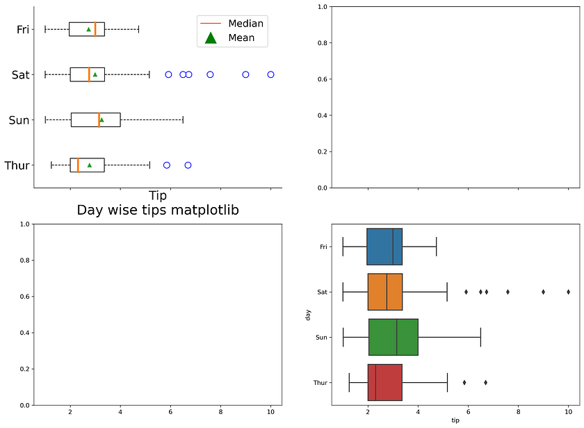
Plot customisation
The next part is plot customisation which is technically the same as we did for matplotlib case. The processes involve:
- removing spines
- Setting axes labels and tick parameters
- setting a plot title at the bottom
# Remove spines
for s in ["top", "right"]:
    ax[1,1].spines[s].set_visible(False)

# Add ticks and legends
ax[1,1].tick_params(labelsize = 18)
ax[1,1].set_title("Day wise tips seaborn", size = 22, y = -0.2, pad = -14)
ax[1,1].set_xlabel("Tip", size = 20)
ax[1,1].set_ylabel("Day", size = 20)
ax[1,1].set_xticks([0,2,4,6,8,10])fig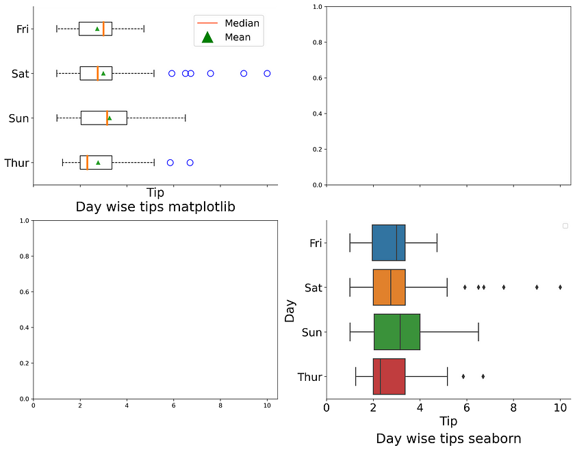
Saving the current plot
To save the plot, we need to call the savefig( ) method from fig object. In addition to that, we can use the try and except clause.
- While running the code, it will first execute the try block and look for the “images” directory, and if it does not exist, it generates a new one.
- The except clause will be executed if the “images” directory already exists.
Once the try and except clause is executed, it will execute the fig.savefig( ) method and save the plot.
- Here we have called the savefig( ) method from the fig object and supplied the image name with extension .png. and set the dpi value to 300. Further, we have supplied bbox_inches = “tight” which will remove the extra spaces around the image border.
import ostry:
    os.mkdir("images")
except:
    print("Directory already exists!")

fig.savefig("images/boxplot.png",
            dpi = 300,
            bbox_inches = "tight")
Boxen plot/letter value plot
The boxen plot or letter value plot is similar to a box plot but provides more information about the shape of the distribution, particularly in the tails.
Seaborn library offers a method for generating a boxen plot similar to a box plot. We need to use the boxenplot( ) method and supply the argument similar to the box plot.
Here, we will position this plot in the row = 1 and column = 0 position (i.e., ax[1,0]).
# Generating a seaborn based boxenplot
sns.boxenplot(x = "tip",
              y = "day",
              data = tips,
              ax = ax[1, 0],
              order = ["Fri", "Sat", "Sun", "Thur"])
fig
Plot customisation
The plot customisation is the same that we did for matplotlib case. The process involves:
- Removing spines
- Setting axes labels and tick parameters
- Setting a plot title at the bottom
# Plot customisation# Remove spines
for s in ["top", "right"]:
    ax[1,0].spines[s].set_visible(False)# Change plot title and labels
ax[1, 0].set_title("Day wise tips seaborn", size = 22, y = -0.2, pad = -14)
ax[1, 0].set_xlabel("Tip", size = 20)
ax[1, 0].set_ylabel("Day", size = 20)# Modify tick and tick parameters
ax[1, 0].tick_params(labelsize = 18)
ax[1, 0].set_xticks([0,2,4,6,8,10])fig
I hope you learned the different ways of generating box plots and boxen plots. The box plot is much more popular than the boxen plot. Even though the boxen plot covers the limitation of the box plot, it is a fairly new plotting method but powerful.
As you are familiar with the box and boxen plots, you can now use the above methods to analyse your data sets.
References:
Click here for the data and code
I hope you learned something new! 😃
If you learned something new and liked this article, share it with your friends and colleagues. If you have any suggestions, drop a comment.