Empirical Cumulative Distribution Function (ECDF) Plotting and Percentile Computation.
Article Outline
- Introduction
- Library and data loading
- Descriptive statistics
- ECDF Plot for overall weight
- 50th and 85th percentile values of overall weight
- ECDF Plot for weight across gender
- 50th and 85th percentile values of weight across gender
- Code: ECDF Github Link
Introduction
In statistics, an empirical distribution function is the distribution function associated with the empirical measure of a sample. This cumulative distribution function is a step function that jumps up by 1/n at each of the n data points. Its value at any specified value of the measured variable is the fraction of observations of the measured variable that are less than or equal to the specified value [source: Wikipedia].
Why we need an ECDF plot?
There are many practical application of ECDF plot and percentiles in the STEM research domain. I’m a Transportation PhD student, so let’s discuss a practical problem related to pedestrian crossing speed at signalized intersection crosswalks.
We all have seen a pedestrian signal at intersections, where the pedestrian signal shows a do-not walk or walk symbol alternatively. The walk signal time length is designed by transportation researchers/planners based on observation of plying traffic volume and overall crossing speed of pedestrians crossing through the intersection crosswalks. Let’s assume that the pedestrian green time is estimated entirely based on crossing speed of pedestrians.
In India, the Indian Road Congress (IRC, 2012) guidelines state that for designing intersection the design walking speed (15th percentile speed) should be taken as 0.98 meters per second. What does that actually mean? This means if we observe a significant number of pedestrians’ crossing behaviour at intersections, and estimate their crossing speed (distance crossed/time taken to cross), 85% of the pedestrians’ speed should be above 0.98 m/s or alternatively 15% of the observed pedestrians’ speed should be below 0.98 m/s.
So, if we design an intersection based on 15th percentile walking speed (0.98 m/s), where 85% of the pedestrian walks equal or above the 0.98 m/s (design) speed then this assumes to be safe as majority of the pedestrians will cross the road within the allotted time. Else they might not able to finish the crossing in the allotted green time and get stuck in the next do-not walk phase and might encounter oncoming traffic.
The above example revealed the importance of ECDF plot and percentile values in the transportation research domain. The Empirical Cumulative Distribution Function (ECDF) plot will help you to visualize and calculate percentile values for decision making.
In this article, we will use a weight_height data set for visualizing ECDF plots and for computing percentiles using both Python and R.
Loading libraries
The first step is to import libraries
Import Python Libraries
import numpy as np # array manipulation
import pandas as pd # data manipulation
import matplotlib.pyplot as plt # plotting
import seaborn as sns # plotting
import dc_stat_think as dcst # ecdf estimation
Import R Libraries
library(tidyverse) # data manipulation and plottingThe next step is to set font family and size so that matplotlib will generate publication-ready ascetics.
font = {'family' : 'normal',
        'weight' : 'normal',
        'size'   : 15}
plt.rc('font', **font)
Let’s explore the data set. The data includes 10000 observations of weight and height measurements of people. The data set is obtained from kagge.com uploaded by Mustafa Ali.
Python Data Loading and Exploration
Let’s first read the data using pandas pd.read_csv( ) function and see the first five observations. The data set include three columns i.e., Gender, Height and Weight.
weight_height = pd.read_csv("weight_height.csv")
weight_height.head()
R Data Loading and Exploration
Similarly, we can load the data into R session using read_csv( ) function obtained from readr package which is built under tidyverse family
# Loading data
weight_height <- read_csv("weight_height.csv")
head(weight_height)
Descriptive Statistics
Let’s look at the descriptive statistics of the weight-height data set.
Descriptive stats using Python
Let us explore the relationship between Height and Weight. We can use the jointplot( ) function from the seaborn library. The plot revealed that there is a positive association exist between a person’s height and weight. As height increases the weight is also increases. It can be observed that variables such as weight and height are approximately normally distributed.
sns.jointplot(x="Height", y="Weight", data=weight_height, color = "k")
The Pearson correlation revealed a strong positive correlation between height and weight (Pearson’s correlation is about 0.925).
from scipy import stats
weight = weight_height.Weight
height = weight_height.Height
stats.pearsonr(height, weight)
Pearson’s correlation coefficient (r): 0.925 & p-value = 0.0
Descriptive stats using R
Similar to jointplot( ), you could generate a scatter plot in R using WVPlots package. You could utilize the scatterHist( ) function to generate the scatter plot + histograms combination. The plot by default add a density line.
library(WVPlots)
ScatterHist(weight_height, "Height", "Weight",
            smoothmethod= "none",
            hist_color = "steelblue",
            density_color = "red",
            title="Height vs Weight")
ECDF Plotting and Percentile Computation
In the following, we will use the weight data for generating ECDF and computing percentiles.
let’s save the Weight data to weight variable in python.
weight = weight_height.WeightSame can be done using the following code in R.
weight = weight_height$WeightWeight Analysis
In order to plot the ECDF we first need to compute the cumulative values. For calculating we could use the Python’s dc_stat_think package and import it as dcst. We can generate the values by calling the dcst class method ecdf( ) and save the generated values in x and y. Next, we can plot it using the matplotlib’s plt.plot( ) function, where you need to specify the linestyle as “— —” and line width (lw) = 2. To compute percentages just multiply the “y” input with 100.
# Generate x and y values for ECDF: x, y
x, y = dcst.ecdf(weight)
# Plot the ECDF as dots
_ = plt.plot(x, y*100, linestyle='--', lw = 2)
# Label axes and show plot
_ = plt.xlabel('Weight', size = 14)
_ = plt.ylabel('ECDF', size = 14)
plt.show()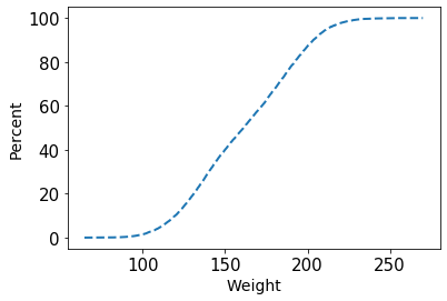
In R we could generate the ECDF plot directly using ggplot2. Before proceeding to the plotting code, here I have written code for a proper plotting theme, which makes the plot publication-ready.
new_theme <- theme(axis.text=element_text(size=14),
                   axis.title=element_text(size=20,face="bold"), legend.text=element_text(size=22),
                   legend.title = element_text(face = "bold", size = 26), legend.position="top",
                   axis.line = element_line(colour="black", size=1, lineend="square"),
                   strip.text.y = element_text(size = 12, colour = "gray30"))
In R we could use ggplot( ) and additionally use the stat_ecdf( ) function, which internally computes the values and plot it. You need to set the geom = “point” so that the values are represented using point geometric. To plot the y values as percentage, use scales library: scale_y_continuous(labels = scales::percent)
ggplot(weight_height, aes(weight)) +
  stat_ecdf(geom = "point") +
  scale_y_continuous(labels = scales::percent) +
  theme_bw() +
  new_theme +
  xlab("Weight") +
  ylab("Percent")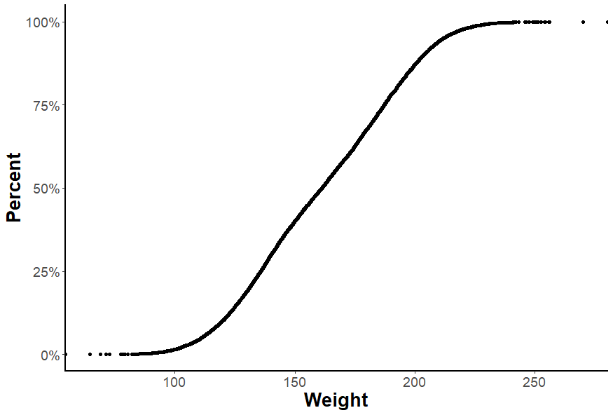
Plot Explanation
The ECDF plot could be used to answer different questions. For example, one question could be what is the weight value in which 50% of the sample below that value and 50% above that value. If you observe the above ECDF plot, the value associated with 50% is 161.21 units. Similarly, you could identify the value corresponding to 85% which shows 85% of the observation is below that value and 15% observations are above that value.
Let’s go for another example, say if you have plotted an ECDF plot for the entire class students’ math exam score and you wanted to know what is the score required by a student to reach the top 10% math scorer in the class. You could just look at the value corresponding to the 90% in ECDF plot and straight away get the score value.
Percentile value computation
You could also arrive at the same result using the numpy’s percentile( ) function, which will give you the value corresponding to a percentile value. Here we have computed the 50th percentile and 85th percentile values.
print("""
50th and 85th Percentile values are: {0:.2f} and {1:.2f}
""".format(*np.percentile(weight, [50, 85])))
50th and 85th Percentile values are: 161.21 and 197.54
We could mark the percentile values in the ECDF plot using the following code.
percentiles = np.array([50 , 85])
pct_val = np.percentile(weight, percentiles)
x, y = dcst.ecdf(weight)
_ = plt.plot(x, y*100, linestyle='--', lw = 2)
_ = plt.xlabel('Weight', size = 14)
_ = plt.ylabel('Percent', size = 14)
_ = plt.plot(pct_val, percentiles, marker='o', color='red',
         linestyle='none')
plt.show(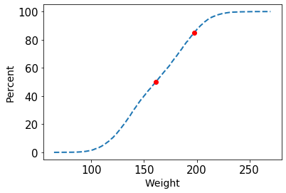
In the case of R, you could use the quantile( ) function to get the same result.
quantile(weight, c(0.5, 0.85))50th and 85th Percentile values are: 161.21 and 197.54
ECDF Plot Across Gender
Next, say you want to plot the ECDF separately for Male and Female person. You could filter out the data for the male and female person and calculate the values using ecdf( ). Then use the matplotlib’s plt.plot( ) function to overlay both geometric one over another. This would help you compare the weight across gender.
male_weight = weight_height[weight_height.Gender == "Male"].Weight
female_weight = weight_height[weight_height.Gender == "Female"].Weight

# Generate x and y values for ECDF: x, y
x_male, y_male = dcst.ecdf(male_weight)
x_female, y_female = dcst.ecdf(female_weight)
# Plot the ECDF as dots
_ = plt.plot(x_male, y_male*100, linestyle='--', lw = 2)
_ = plt.plot(x_female, y_female*100, linestyle='--', lw = 2)
# Label axes and show plot
_ = plt.legend(("Male", "Female"))
_ = plt.xlabel('Weight', size = 14)
_ = plt.ylabel('ECDF', size = 14)
plt.show()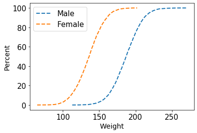
In the case of R, we could use the ggplot( ) function and just supply the Gender variable in the colour arguments inside the aesthetic (aes) function.
## Weight ECDF Across Gender
ggplot(weight_height, aes(weight, color = Gender)) +
  stat_ecdf(geom = "point", size = 3)+
  scale_y_continuous(labels = scales::percent) +
  theme_classic() +
  new_theme +
  xlab("Weight") +
  ylab("Percent")
The percentile values can be estimated in a similar fashion using the np.percentile( ) function in Python.
print("""
Male's 50th and 85th Percentile values are {0:.2f} and {1:.2f}
""".format(*np.percentile(male_weight, [50, 85])))

print("""
Female's 50th and 85th Percentile values are {0:.2f} and {1:.2f}
""".format(*np.percentile(female_weight, [50, 85])))
Male’s 50th and 85th Percentile values are 187.03 and 207.25
Female’s 50th and 85th Percentile values are 136.12 and 155.89
Similarly, quantile( ) function could be used for percentile computation in R.
male_weight = weight_height[weight_height$Gender == "Male", ]
female_weight = weight_height[weight_height$Gender == "Female", ]
quantile(male_weight$Weight, c(0.5, 0.85))
quantile(female_weight$Weight, c(0.5, 0.85))
Male’s 50th and 85th Percentile values are 187.03 and 207.25
Female’s 50th and 85th Percentile values are 136.12 and 155.89
In STEM research ECDF plot and percentile values are very frequently used for decision making.
Click here for Code: ECDF Github Link
I would like to thank Justin Bois (Lecturer at the California Institute of Technology) for the Statistical Thinking in Python Datacamp course.
I hope this would help.
Image Credit: Photo by Edward Howell on Unsplash


