Rahul Raoniar
- posted on
- Comments Off on How to Create and Customize Bar Plot Using ggplot2 Package in R

A bar plot (or bar chart) is one of the most common types of graphics used in research or presentation. It shows the relationship between a numeric and a categorical variable. Each label of the category variable is represented as a bar. The height of the bar represents its numeric value.
Article Outline
- Creating a Data Frame
- Creating a stacked bar plot
- Creating a dodged bar plot
- Palette based and Manual Color filling
- Styling bar plot (making it publication-ready)
R statistical programming language has one beautiful library called ggplot2 which is developed based on the concept of the grammar of graphics. In this article, we are going to leverage the potential of ggplot2 for making bar plots.
Before starting with ggplot2, we need to have some data first. Assume, we are researchers and for fun, we want to know how many cars are passing through the arterial road in-front of our house. So, we selected two road location site 1 and site 2 and standing in front of the road on January 7th we started counting cars passing through for one hour (9 am to 10 am). To gather more data we made another observation on 14th January. So here, you can see the data frame “experiment” based on the observations.
experiment <- data.frame(site = c("Site1", "Site1", "Site2", "Site2"),
                    date = c("Jan7", "Jan14", "Jan7", "Jan14"),
                    car_count = c(65, 40, 75, 45))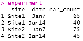
Now comes the presentation part. To present count data comparison, bar plot would be a best suited graphical representation. Hence, here we pick up the ggplot2 library for making a bar plot.
Stack Bar Plot
The ggplot2 package is very simple but powerful. In ggplot the plotting comprised of data, aesthetics (data attributes) and geometric (point, line, bar etc.).
To plot using ggplot2 I have called the ggplot( ) function and pass the data argument (experiment), then in the aesthetic part supplied the x-axis feature/variable “x = date” and y-axis feature/variable “y = car_count” and also provided the “site” as colour fill argument. The next part is the geometric feature with which we want to present the data. Here we need to plot bars so I called the geom_bar( ) function. As we want to plot the bar height same as supplied data thus added an argument stat = “identity”. If you have a categorical column where you want ggplot2 to count the repeated (unique) labels and plot it as bar then you should avoid the stat = “identity” part.
ggplot(data = experiment, mapping = aes(x = date, y = car_count, fill = site)) +
  geom_bar(stat = "identity")
OR
Another way of avoiding the automatic counting part by using geom_col( ) function.
ggplot(data = experiment, mapping = aes(x=date, y=car_count, fill=site)) +
  geom_col()
By default ggplot2 creates a stacked bar plot where count observation will be stacked one over another.

You can reverse the stack position using the position = position_stack(reverse = TRUE) argument. Once we change the stack order next you need to change the order of the legend. We could do that adding guides(fill = guide_legend(reverse = TRUE)) argument.
ggplot(data = experiment, mapping = aes(x=date, y=car_count, fill=site)) +
  geom_bar(stat="identity", position = position_stack(reverse=TRUE)) +
  guides(fill = guide_legend(reverse=TRUE))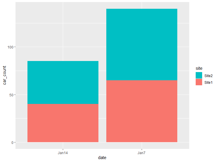
Dodge Bar Plot
You can modify the code to plot bars side by side which also known as “dodged” plot. To plot a dodged bar plot you need to supply the position = “dodge” argument inside the geom_bar( ) function.
ggplot(data = experiment, mapping = aes(x=date, y=car_count, fill=site)) +
  geom_bar(stat="identity", position = "dodge)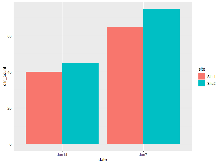
Changing the default fill color
The above bar plots inherited the default colours during plotting. You could add colour to different bar groups using a colour palette or you could add it manually.
scale_fill_brewer()
To add colour using predefined palette use the scale_fill_brewer() function and supply the palette name in palette argument. Here, I have supplied Pastel2 palette.
ggplot(data = experiment, mapping = aes(x=date, y=car_count, fill=site)) +
  geom_bar(stat="identity", position = "dodge") +
  scale_fill_brewer(palette = "Pastel2")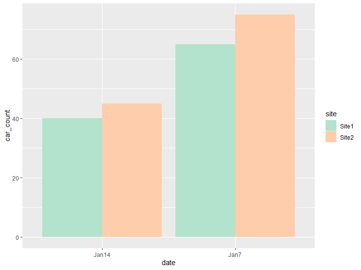
scale_fill_manual()
Instead of colour palette, one can specify the colour manually using scale_fill_manual( ) function. Here, I have supplied red and blue colours using the values argument.
ggplot(data = experiment, mapping = aes(x=date, y=car_count, fill=site)) +
  geom_bar(stat="identity", position = "dodge") +
  scale_fill_manual(values = c("red", "blue"))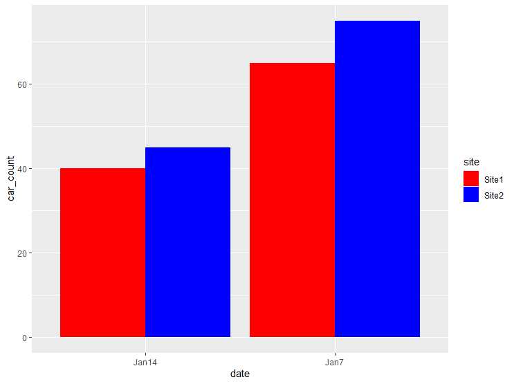
Controlling Bar Spacing
In order to increase the bar spacing, you need to set position_dodge to be larger than the bar width value.
ggplot(data = experiment, mapping = aes(x = date, y = car_count, fill = site)) +
  geom_bar(stat = "identity", width = 0.5, position = position_dodge(0.8))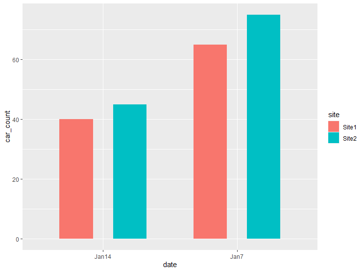
Bar label on dodged bar plot
For making bar plot publication-ready we need to make it more informative. We can add the bar labels that provide easy to understand information. To add bar label use the geom_text( ) function and supply the variable that you want to show as bar label inside the aesthetic. To adjust the labels vertical position one can use the vjust argument. Here I have used vjust = -0.2 and label size = 5. Additionally, extended the y-axis limit using ylim( ) function so that bar label does not exceed the top canvas.
ggplot(data = experiment, mapping = aes(x=date, y=car_count, fill=site)) +
  geom_bar(stat="identity", position = "dodge") +
  geom_text(aes(label = car_count), vjust = -0.2, size = 5,
            position = position_dodge(0.9)) +
  ylim(0, max(experiment$car_count)*1.1)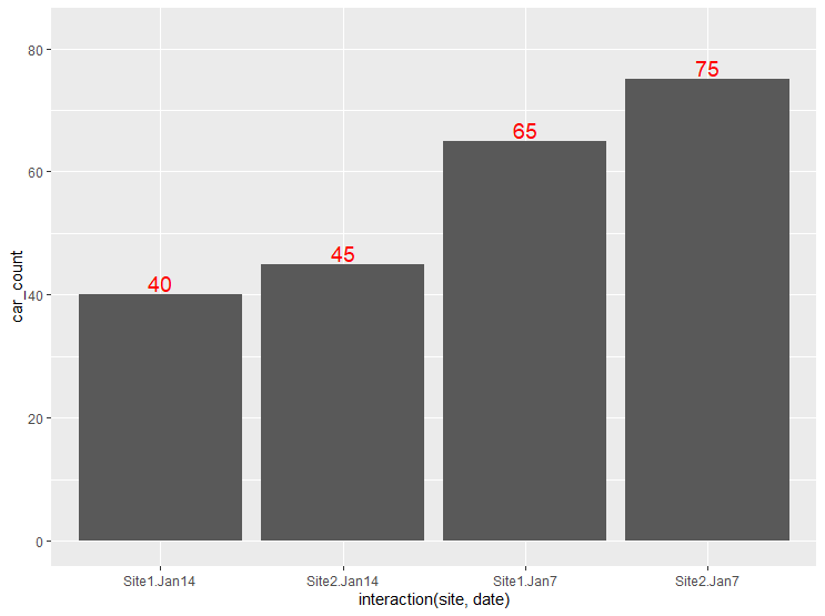
Bar labels on stack bar plot
In a similar fashion, you could add the bar label to stack bar plot. Just you need to replace the position argument with position_stack( ).
ggplot(data = experiment, mapping = aes(x=date, y=car_count, fill=site)) +
  geom_bar(stat="identity") +
  geom_text(aes(label=car_count), position = position_stack(vjust= 0.5),
            colour = "white", size = 5)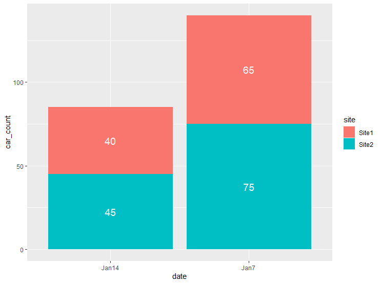
Improving bar plot aesthetic
We can improve the same plot and make it publication-ready with few modifications. The steps involved the following:
- Plot stacked bar graph
- Change outline colour to black using colour = ”black”
- Resize the text
- Add “cars” using paste() function
- Remove digits after decimal point using format()
- Adding a classic theme using theme_classic( )
- Use Pastel1 color combination using scale_fill_brewer( )
geom_bar(stat="identity", colour = "black", width = 0.6) +
  geom_text(aes(label = paste(format(car_count, nsmall=0), "cars")),
            position = position_stack(vjust= 0.5),
            colour = "black", size = 5) +
  theme_classic() +
  scale_fill_brewer(palette = "Pastel1")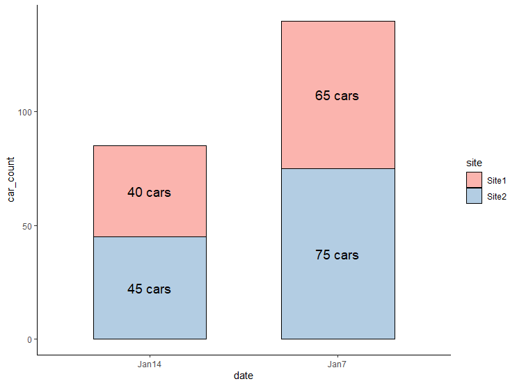
The ggplot2 library is created by Hadley Wickham. This is one the most popular package out there for creating publication-ready graphics. You can leverage the potential of this package in Python using plotnine package.
I hope you learned something new. See you next time!
If you learned something new and liked this article, follow me on onezero.blog (my personal blogging website), Twitter, LinkedIn, YouTube and Github.
Featured Image Credit: Photo by Carlos Muza on Unsplash
References
H. Wickham. ggplot2: Elegant Graphics for Data Analysis. Springer-Verlag New York, 2016.