Rahul Raoniar
- posted on
- Comments Off on Modelling Binary Logistic Regression Using R

Introduction
In the supervised machine learning world, there are two types of algorithmic tasks often performed. One is called regression (predicting continuous values) and the other is called classification (predicting discrete values). In this blog, I have presented an example of a binary classification algorithm called “Binary Logistic Regression” which comes under the Binomial family with a logit link function. Binary logistic regression is used for predicting binary classes. For example, in cases where you want to predict yes/no, win/loss, negative/positive, True/False and so on. There is quite a bit difference between training/fitting a model for production and research publication. This blog will guide you through a research-oriented practical overview of modelling and interpretation i.e., how one can model a binary logistic regression and interpret it for publishing in a journal/article.
Article Outline
- Data Background
- Aim of the modelling
- Data Loading
- Basic Exploratory Analysis
- Data Preparation
- Model Fitting/Training
- Interpretation of Model Summary
- Model Evaluation on Test data Set
- References
Data Background
In this example, we are going to use the Pima Indian Diabetes 2 data set obtained from the UCI Repository of machine learning databases (Newman et al. 1998).
This data set is originally from the National Institute of Diabetes and Digestive and Kidney Diseases. The objective of the data set is to diagnostically predict whether or not a patient has diabetes, based on certain diagnostic measurements included in the data set. Several constraints were placed on the selection of these instances from a larger database. In particular, all patients here are females at least 21 years old of Pima Indian heritage.
The Pima Indian Diabetes 2 data set is the refined version (all missing values were assigned as NA) of the Pima Indian diabetes data. The data set contains the following independent and dependent variables.
Independent variables (symbol: I)
- I1: pregnant: Number of times pregnant
- I2: glucose: Plasma glucose concentration (glucose tolerance test)
- I3: pressure: Diastolic blood pressure (mm Hg)
- I4: triceps: Triceps skin fold thickness (mm)
- I5: insulin: 2-Hour serum insulin (mu U/ml)
- I6: mass: Body mass index (weight in kg/(height in m)\²)
- I7: pedigree: Diabetes pedigree function
- I8: age: Age (years)
Dependent Variable (symbol: D)
- D1: diabetes: diabetes case (pos/neg)
Aim of the Modelling
- fitting a binary logistic regression machine learning model that accurately predicts whether or not the patients in the data set have diabetes
- understanding the influence of significant variables on diabetes prediction
- testing the trained model’s generalization (model evaluation) strength on the unseen/test data set.
Loading Libraries and Data Set
Step1: At first we need to install the following packages using install.packages( ) function and loading them using library( ) function.
library(mlbench)     # for PimaIndiansDiabetes2 dataset
library(dplyr)       # for data manipulation (dplyr)
library(broom)       # for making model summary tidy
library(visreg)      # for potting logodds and probability
library(margins)     # to calculate Average Marginal Effects
library(rcompanion)  # to calculate pseudo R2
library(ROCR) # to compute and plot Reciever Opering CurveStep2: Next, we need to load the data set from the mlbench package using the data( ) function.
# load the diabetes dataset
data(PimaIndiansDiabetes2)
Exploratory Data Analysis
Step 1: After data loading, the next essential step is to perform an exploratory data analysis, which will help in data familiarization. Use the head( ) function to view the top six rows of the data.
head(PimaIndiansDiabetes2)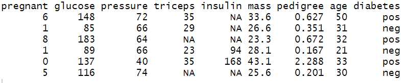
Step 2: Before proceeding to the model fitting part, it is often essential to know about the type of different variables/columns and whether they contain any missing values. The str( ) or glimpse( ) function helps in identifying data types.
The glimpse( ) function of dplyr package revealed that the Diabetes data set has 768 observations and 9 variables. The first 8 variables are numeric/double type and dependent/output variable is of factor/categorical type. It is also noticeable many variables contain NA values. So our next task is to refine/modify the data so that it gets compatible with the modelling algorithm.
# See the data strcuture
glimpse(PimaIndiansDiabetes2)
Data Preparation
Step1: The first step is to remove data rows with NA values using na.omit( ) function.
Step2: Converting the dependent variable “diabetes” into integer values (neg:0 and pos:1) using level( ) function.
Step3: Checking the refined version of the data using glimpse( ) function.
Diabetes <- na.omit(PimaIndiansDiabetes2) #removing NA values
levels(Diabetes$diabetes) <- 0:1
glimpse(Diabetes) 
The final (prepared) data contains 392 observations and 9 columns. The independent variables are numeric/double type, while the dependent/output binary variable is of factor/category type contains negative as 0 and positive as 1.
Model Fitting (Binary Logistic Regression)
The next step is splitting the diabetes data set into train and test split by generating random vector-based indices using sample( ) function.
Train and Test Split
The whole data set generally split into 80% train and 20% test data set (general rule of thumb). The 80% train data is being used for model training, while the rest 20% is used for checking how the model generalized on unseen data set.
# Total number of rows in the Diabetes data frame
n <- nrow(Diabetes)
# Number of rows for the training set (80% of the dataset)
n_train <- round(0.80 * n)
# Create a vector of indices which is an 80% random sample
set.seed(123)
train_indices <- sample(1:n, n_train)
# Subset the Diabetes data frame to training indices only
train <- Diabetes[train_indices, ]
# Exclude the training indices to create the test set
test <- Diabetes[-train_indices, ]
Checking the dimension of train and test data set
paste("train sample size: ", dim(train)[1])
paste("test sample size: ", dim(test)[1])

Fitting Logistic Regression
In order to fit a logistic regression model, you need to use the glm( ) function and inside that, you have to provide the formula notation, training data and family = “binomial”
plus notation →
diabetes ~ ind_variable 1 + ind_variable 2 + …….so on
tilde dot notation →
diabetes~.
means diabetes is predicted by rest of the variables in the data frame (means all independent variables) except the dependent variable i.e. diabetes.
#Fitting a binary logistic regression
model_logi <- glm(diabetes~., data = train, family = "binomial")
#Model summary
summary(model_logi)
Interpretation of Model Summary
After model fitting, the next step is to generate the model summary table and interpret the model coefficients. The model summary includes two segments. The first segment provides model coefficients; their significance and 95% confidence interval values, and the second segment provides model fit statistics by reporting Null Deviance (for intercept model) and Residual Deviance (for fitted model). In publication or article writing you often need to interpret the coefficient of the variable from the summary table.
The model fit statistics revealed that the model was fitted using the Maximum Likelihood Estimation (MLE) technique. The model has converged properly showing no error.
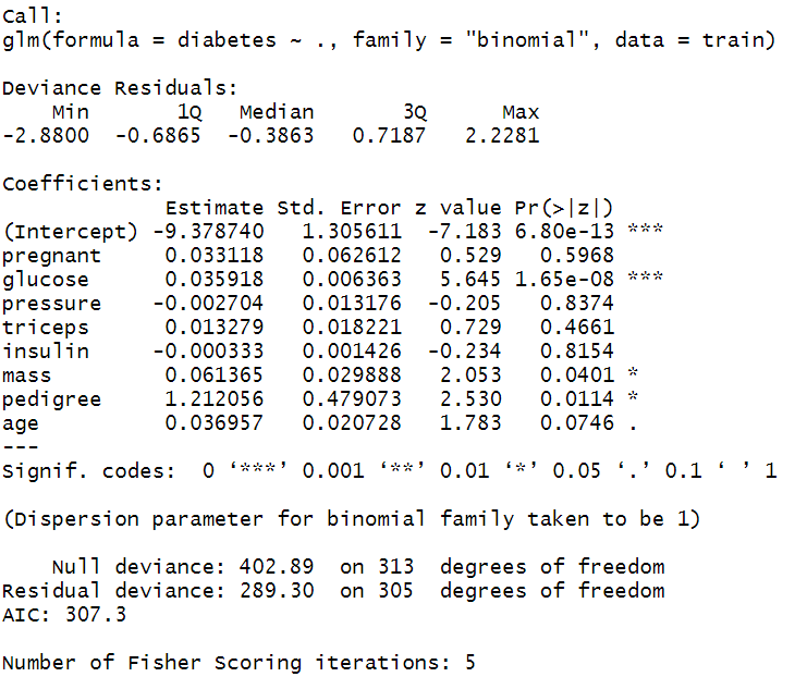
The coefficient table showed that only glucose, mass and pedigree variable has significant positive influence (p-values < 0.05) on diabetes. The coefficients are in log-odds terms. The interpretation of the model coefficients could be as follows:
Each one-unit change in glucose will increase the log odds of having diabetes by 0.036, and its p-value indicates that it is significant in determining diabetes. Similarly, with each unit increase in pedigree increases the log odds of having diabetes by 1.212 and p-value is significant too.
Model Fit Statistics
The nagelkerke( ) function of rcompanion package provides three types of Pseudo R-squared value (McFadden, Cox and Snell, and Cragg and Uhler) and Likelihood ratio test results. The McFadden Pseudo R-squared value is the commonly reported metric for binary logistic regression model fit.The table result showed that the McFadden Pseudo R-squared value is 0.282, which indicates a decent model fit.
Additionally, the table provides a Likelihood ratio test. Likelihood Ratio test (often termed as LR test) is a goodness of fit test used to compare between two models; the null model and the final model. The test revealed that the Log-Likelihood difference between intercept only model (null model) and model fitted with all independent variables is 56.794, indicating improved model fit. Fit improvement is also significant (p-value <0.05).
# Pseudo R_squared values and Likelyhood ratio test
nagelkerke(model_logi)
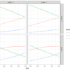
Probability Plot
In order to understand how the diabetes probabilities change with given values of independent variables, one can generate the probability plots using visreg library’s visreg( ) function. Here, we have plotted the pedigree in the x-axis and diabetes probabilities on the y-axis. The vertical rug lines indicate the density of observation along the x-axis. The dark band along the blue line indicates a 95% confidence interval band.
# Probabilities of diabetes wrt pedigree
visreg(model_logi, "pedigree", scale="response", rug=2, xlab="pedigree level",
       ylab="P(diabetes)")
ODDS Ratio
The interpretation of coefficients in the log-odds term does not make much sense if you need to report it in your article or publication. That is why the concept of odds ratio was introduced.
The ODDS is the ratio of the probability of an event occurring to the event not occurring. When we take a ratio of two such odds, it called the Odds Ratio.

Mathematically, one can compute the odds ratio by taking exponent of the estimated coefficients. For example, in the below ODDS ratio table, you can observe that pedigree has an ODDS Ratio of 3.36, which indicates that one unit increase in pedigree label increases the odds of having diabetes by 3.36 times.
(exp(coef(model_logi))) #obtaining odds ratio
Similarly, the ODDS ratio can be retrieved in a beautiful tidy formatted table using the tidy( ) function of broom package.
tidy(model_logi, exponentiate = TRUE, conf.level = 0.95) #odds ratio
Even though the interpretation of the ODDS ratio is far better than log-odds interpretation, still it is not as intuitive as linear regression coefficients; where one can directly interpret that how much a dependent variable will change if making one unit change in the independent variable, keeping all other variables constant. Thus, to get a similar interpretation a new econometric measure often used, known as Marginal Effects.
Marginal Effects Computation
Marginal effects are an alternative metric that can be used to describe the impact of a predictor on the outcome variable. Marginal effects can be described as the change in outcome as a function of the change in the treatment (or independent variable of interest) holding all other variables in the model constant. In linear regression, the estimated regression coefficients are marginal effects and are more easily interpreted. You could read more about why we need Marginal Effects by downloading the presentation [source: Marcelo Coca Perraillon (University of Colorado)] using the following link.
Click here: Link to “why we need Marginal Effects”
There are three types of marginal effects reported by researchers: Marginal Effect at Representative values (MERs), Marginal Effects at Means (MEMs), and Average Marginal Effects at every observed value of x and average across the results (AMEs), (Leeper, 2017). For categorical variables, the average marginal effects were calculated for every discrete change corresponding to the reference level.
In the STEM research domains, Average Marginal Effects are very popular and often reported by researchers. In our case, we have estimated the AMEs of the predictor variables using margins( ) function of margins package and printed the report summary.
The Average Marginal Effets table reports AMEs, standard error, z-values, p-values, and 95% confidence intervals. The interpretation of AMEs is similar to linear models. For example, the AME value of pedigree is 0.1810 which can be interpreted as a unit increase in pedigree value increases the probability of having diabetes by 18.10%.
# Calculate average marginal effect
effects_logit_dia = margins(model_logi)
# Summary of marginal effect
summary(effects_logit_dia)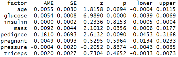
Margins plot
Instead of the table, one can visualize the AMEs values using the R’s inbuilt plot function.
plot(effects_logit_dia) #plotting marginal effects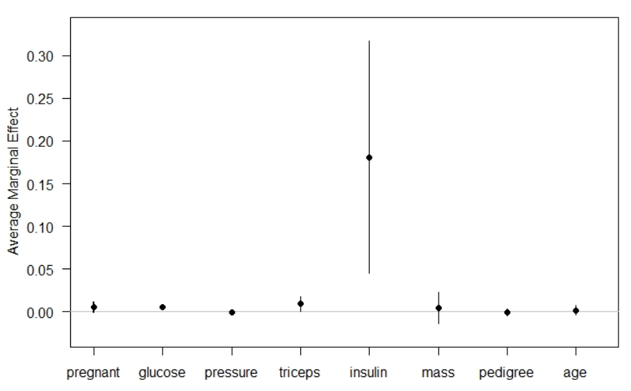
Model Evaluation on Test Data Set
After fitting a binary logistic regression model, the next step is to check how well the fitted model performs on unseen data i.e. 20% test data.
Thus, the next step is to predict the classes in the test data set and generating a confusion matrix. The steps involved the following:
- The first step is predicting the diabetes probabilities of test data set using predict( ) function.
- Setting a cut-off value (0.5 for binary classification). Below 0.5 of probability treated diabetes as neg (0) and above that pos (1)
- Use table( ) function to create a confusion matrics between Actual/Reference (neg:0, pos:1) and Predicted (neg:0, pos:1)
- Use yardstick packages’ accuracy( ) function to compute the classification accuracy on the test data set
Confusion Matrix and Classification Accuracy
The confusion matrix revealed that the test dataset has 55 sample cases of negative (0) and 23 cases of positive (1). The trained model classified 52 negatives (neg: 0) and 17 positives (pos: 1) class, accurately.
# predict the test dataset
pred <- predict(model_logi, test, type="response")
predicted <- round(pred) # round of the value; >0.5 will convert to
                         # 1 else 0
# Creating a contigency table
tab <- table(Predicted = predicted, Reference = test$diabetes)
tab
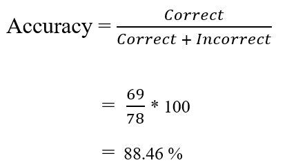
Next, we can calculate the accuracy manually using the following formula. The results revealed that the classifier is about 88.46% accurate in classifying unseen/test data.
Similarly, accuracy can be also estimated using the accuracy( ) function from the yardstick library.
# Creating a dataframe of observed and predicted data
act_pred <- data.frame(observed = test$diabetes, predicted =
                      factor(predicted))
# Calculating Accuracy
accuracy_est <- accuracy(act_pred, observed, predicted)
print(accuracy_est)
# Note: the accuracy( ) function gives rounded estimate i.e. 0.885
Cutoff Values vs Accuracy
For computing the predicted class from predicted probabilities, we used a cutoff value of 0.5. But, the value of 0.5 might not be the optimal value that maximizes accuracy. Thus to obtain the optimal cutoff value we can compute and plot the accuracy of our logistic regression with different cutoff values.
pred.rocr <- prediction(pred, test$diabetes)
eval <- performance(pred.rocr, "acc")
plot(eval)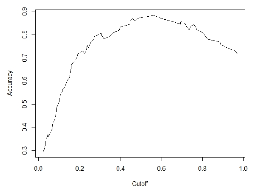
The estimate shows that a cutoff value of 0.5629690 provides the maximum classification accuracy of 0.8846154.
# Identifying the best cutoff value that maximizes accuracy
max <- which.max(slot(eval, "y.values")[[1]])
acc <- slot(eval, "y.values")[[1]][max] #y.values are accuracy
                                        #measures
cut <- slot(eval, "x.values")[[1]][max] #x.values are cutoff
                                        #measures
print(c(Accuracy = acc, Cutoff = cut))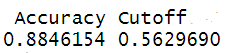
Precision, Recall and F1-Score
A Classification report (includes: precision, recall and F1 score) is often used to measure the quality of predictions from a classification algorithm. How many predictions are true and how many are false. The classification report uses True Positive, True Negative, False Positive and False Negative in classification report generation.
- TP / True Positive: when an actual observation was positive and the model prediction is also positive
- TN / True Negative: when an actual observation was negative and the model prediction is also negative
- FP / False Positive: when an actual observation was negative but the model prediction is positive
- FN / False Negative: when an actual observation was positive but the model prediction is negative
The classification report provides information on precision, recall and F1-score.
We have already calculated the classification accuracy then the obvious question would be, what is the need for precision, recall and F1-score? The answer is accuracy is not a good measure when a class imbalance exists in the data set. A data set is said to be balanced if the dependent variable includes an approximately equal proportion of both classes (in binary classification case). For example, if the diabetes dataset includes 50% samples with diabetic and 50% non-diabetic patience, then the data set is said to be balanced and in such case, we can use accuracy as an evaluation metric. But in real-world it is often not the actual case.
Let’s make it more concrete with an example. Say you have gathered a diabetes data set that has 1000 samples. You passed the data set through your trained model and the model predicted all the sample as non-diabetic. But later when you skim through your data set, you observed in the 1000 sample data, 3 patients have diabetes. So out model misclassified the 3 patients saying they are non-diabetic (False Negative). Even after 3 misclassifications, if we calculate the prediction accuracy then still we get a great accuracy of 99.7%.
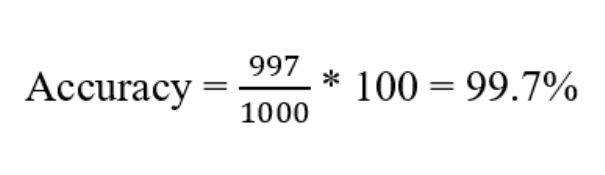
But practically the model does not serve the purpose i.e., accurately not able to classify the diabetic patients, thus for imbalanced data sets, accuracy is not a good evaluation metric.
To cope with this problem the concept of precision and recall was introduced.

Precision: determines the accuracy of positive predictions.
Recall: determines the fraction of positives that were correctly identified.
F1 Score: is a weighted harmonic mean of precision and recall with the best score of 1 and the worst score of 0. F1 score conveys the balance between the precision and the recall.
The model evaluation metrics revealed that the precision and recall values are 0.897 and 0.945 respectively. The F1 score is about 0.92, which indicates that the trained model has a classification strength of 92%.
library(yardstick)
# Creating a actual/observed vs predicted dataframe
act_pred <- data.frame(observed = test$diabetes, predicted =
                       factor(predicted))
# Calculating precision, recall and F1_score
prec <- precision(act_pred, observed, predicted)
rec <- recall(act_pred, observed, predicted)
F1_score <- f_meas(act_pred, observed, predicted) #called f_measure
print(prec)
print(rec)
print(F1_score)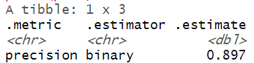


Area Under the Receiver Operating Curve
Sometimes researchers also opt for AUC-ROC for model performance evaluation. AUC-ROC curve is a performance measurement for the classification problem at various threshold settings. ROC tells how much model is capable of distinguishing between classes. Higher the AUC, better the model is at distinguishing between patients with diabetes and no diabetes.
The ROC curve is plotted with TPR against the FPR where TPR is on y-axis and FPR is on the x-axis. The line that is drawn diagonally to denote 50–50 partitioning of the graph. If the curve is more close to the line, lower the performance of the classifier, which is no better than a mere random guess. Our model has got an AUC-ROC score of 0.8972 indicating a good model that can distinguish between patients with diabetes and no diabetes.
perf_rocr <- performance(pred.rocr, measure = "auc",
                         x.measure = "cutoff")
perf_rocr@y.values[[1]] <- round(perf_rocr@y.values[[1]], digits =
                                 4)
perf.tpr.fpr.rocr <- performance(pred.rocr, "tpr", "fpr")
plot(perf.tpr.fpr.rocr, colorize=T,
     main = paste("AUC:", (perf_rocr@y.values)))
abline(a = 0, b = 1)
Binary logistic regression is still a vastly popular ML algorithm (for binary classification) in the STEM research domain. It is still very easy to train and interpret, compared to many sophisticated and complex black-box models.
Dataset and Code
Click here for diabetes data and code
Photo Credit: Photo by Markus Winkler on Unsplash