Rahul Raoniar
- posted on
- Comments Off on Generate Publication-Ready Plots Using Seaborn Library (Part-1)
The visualization is an important part of any data analysis. This helps us present the data in pictorial or graphical format. Data visualization helps in
- Grasp information quickly
- Understand emerging trends
- Understand relationships and pattern
- Communicate stories to the audience
I’m a PhD student in the Department of Civil Engineering at IIT Guwahati. I work in the transportation domain, thus I’m fortunate that I get to work with lots of data. In the data analysis part of the task, I have to often perform exploratory analysis. When comes to visualization my all-time favourite is ggplot2 library (R’s plotting library: R is a statistical programming language) which is one of the popular plotting tools. Recently, I also started implementing the same using python due to recent advancements in this language libraries. I have observed a significant improvement in python data analysis tools specifically, data manipulation, plotting and machine learning. So, I thought let’s see whether python visualization tools offer similar flexibility or not like what ggplot2 does. So, I tried several libraries like Matplotlib, Seaborn, Bokeh and Plotly. As per my experience, we could utilize seaborn (static plots) and Plotly (interactive plots) for the majority of exploratory analysis tasks with very few lines of codes and avoiding complexity.
After going through different plotting tools, especially in Python, I have observed that still there are challenges one would face while implementing plots using the Matplotlib and Seaborn library. Especially, when you want it to be publication-ready. During learning, I have gone through these ups and downs. So, let me share my experience here.
The Seaborn library is built on the top of the Matplotlib library and also combined to the data structures from pandas. The Seaborn blog series will be comprised of the following five parts:
Part-1. Different types of plots using seaborn
Part-2. Facet, Pair and Joint plots using seaborn
Part-3. Seaborn’s style guide and colour pallets
Part-4. Seaborn plot modifications (legend, tick, and axis labels etc.)
Part-5. Plot saving and miscellaneous
Aim of the article
The aim of the current article is to get familiar ourself with different types of plots. We will explore various types of plots and also tweak them a little bit to suit our need using Seaborn and Matplotlib library. I have aggregated different plots into the following categories.
- Distribution plots
- Categorical plots
- Regression Plot
- Time Series Plots
- Matrix plots
Importing libraries
The first step of any analysis is to install and load the relevant libraries.
import numpy as np               # Array manipulation
import pandas as pd              # Data Manipulation
import matplotlib.pyplot as plt  # Plotting
import seaborn as sns            # Statistical plotting
About dataset
In this blog, we primarily going to use the Tips dataset. The data was reported in a collection of case studies for business statistics. The dataset is also available through the Python package Seaborn.
Source:
Bryant, P. G. and Smith, M. A. (1995), Practical Data Analysis: Case Studies in Business Statistics, Richard D. Irwin Publishing, Homewood, IL.
The Tips data contains 244 observations and 7 variables (excluding the index). The variables descriptions are as follows:
bill: Total bill (cost of the meal), including tax, in US dollars
tip: Tip (gratuity) in US dollars
sex: Sex of person paying for the meal (Male, Female)
smoker: Presence of smoker in a party? (No, Yes)
weekday: day of the week (Saturday, Sunday, Thursday and Friday)
time: time of day (Dinner/Lunch)
size: the size of the party
Loading dataset
The first step of any analysis is to load the dataset. Here, we are loading the dataset from Seaborn package using load_dataset( ) function. We can check the first 5 observations using the head( ) function.
tips = sns.load_dataset("tips")
tips.head()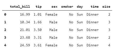
Lets’ explore the shape of the dataset. The dataset contains 244 observations and 7 variables.
tips.shape(244, 7)
Defining Style and Context
Seaborn offers five preset seaborn themes: darkgrid, whitegrid, dark, white, and ticks. The default theme is darkgrid. Here we will set the white theme to make the plots aesthetically beautiful.
Plot elements can be scaled using set_context( ). The four preset contexts, in order of relative size, are paper, notebook, talk, and poster. The notebook style is the default. Here we are going to set it to paper and scale the font element to 2.
sns.set_style('white')
sns.set_context("paper", font_scale = 2)
1. Distribution Plots
All type of distribution plot can be plotted using displot( ) function. To change the plot type you just need to supply the kind = ` ` argument which supports histogram (hist), Kernel Density Estimate (KDE: kde) and Empirical Cumulative Distribution Function (ECDF: ecdf).
1.1 Histogram
We can plot a histogram using the displot( ) function by supplying kind = “hist”. We can also supply the bins argument as per our requirement. I have set the aspect ratio to 1.5 to make the plot a little bit wider.
sns.displot(data=tips, x="total_bill", kind="hist", bins = 50, aspect = 1.5)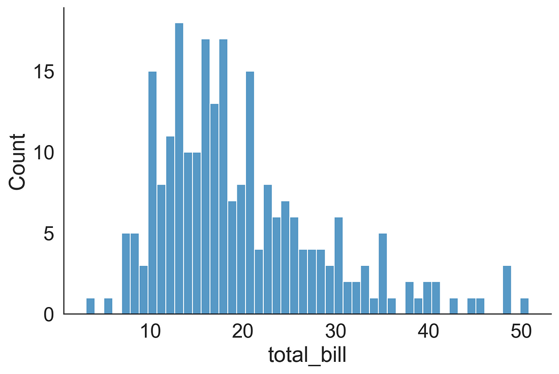
1.2 Histogram + KDE
We can plot a histogram + KDE (overlaid) using the displot( ) function by supplying kind = “hist” and kde = True.
sns.displot(data=tips, x="total_bill", kind="hist", kde = True, bins = 50, aspect=1.5)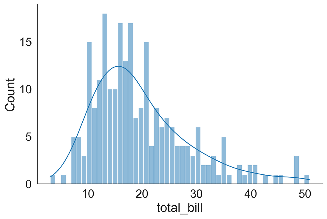
1.3 Gaussian Kernel Density Estimation (KDE) Plot
We can plot a KDE using the displot( ) function by supplying kind = “kde”.
sns.displot(data=tips, x="total_bill", kind="kde", aspect=1.5)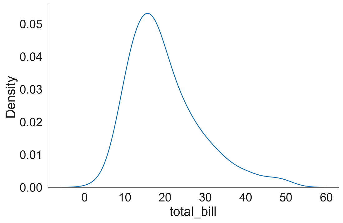
1.4 ECDF plot
We can plot an ECDF using the displot( ) function by supplying kind = “ecdf”.
sns.displot(data=tips, x="total_bill", kind="ecdf", aspect=1.5)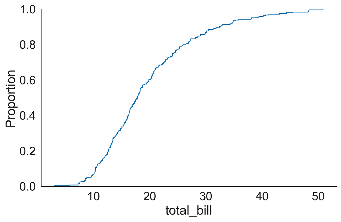
2. Categorical Plot Types
2.1 Plots that shows every observation
First, we will start with plots which are very helpful in displaying individual observations. These plots are very useful when we have a small dataset.
2.1.1 Stripplot
A strip plot could be a good alternative to box or violin plot when we want to display all observations but this work fine when we have a small dataset.
Let’s see how the tips are distributed over different days.
It comes handy if you have a figure (fig) and axis (ax) object. You could get it by using plt.subplots( ) function obtained from Matplotlib library. Here we fixed the figure size to 10 x 6. We supplied day on the x-axis and tip on the y-axis. You can add little bit randomness using jitter = True so that you could see the observations if they are overlapping. Here, I have added a point size of 8.
To make the plot visually aesthetic, I have removed the top and right spines using: sns.despine(right = True).
You can observe that people tips a big chunk during the weekend (especially Saturdays).
fig, ax = plt.subplots(figsize=(10, 6))
sns.stripplot(x = "day",
              y = "tip",
              data = tips,
              jitter = True,
              ax = ax,
              s = 8)
sns.despine(right = True)
plt.show()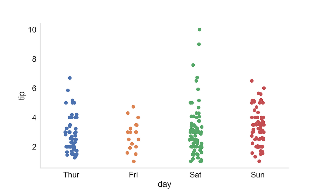
2.1.2 Swarmplot
The swarm plot is also known as a bee swarm plot. It is similar to a strip plot, but the points are adjusted along the categorical axis so that they don’t overlap. It provides a better representation of the distribution of values, but not very scalable for a large number of observations.
fig, ax = plt.subplots(figsize=(10, 6))
sns.swarmplot(x = "day",
              y = "tip",
              data = tips,
              ax = ax,
              s = 8)
sns.despine(right = True)
plt.show()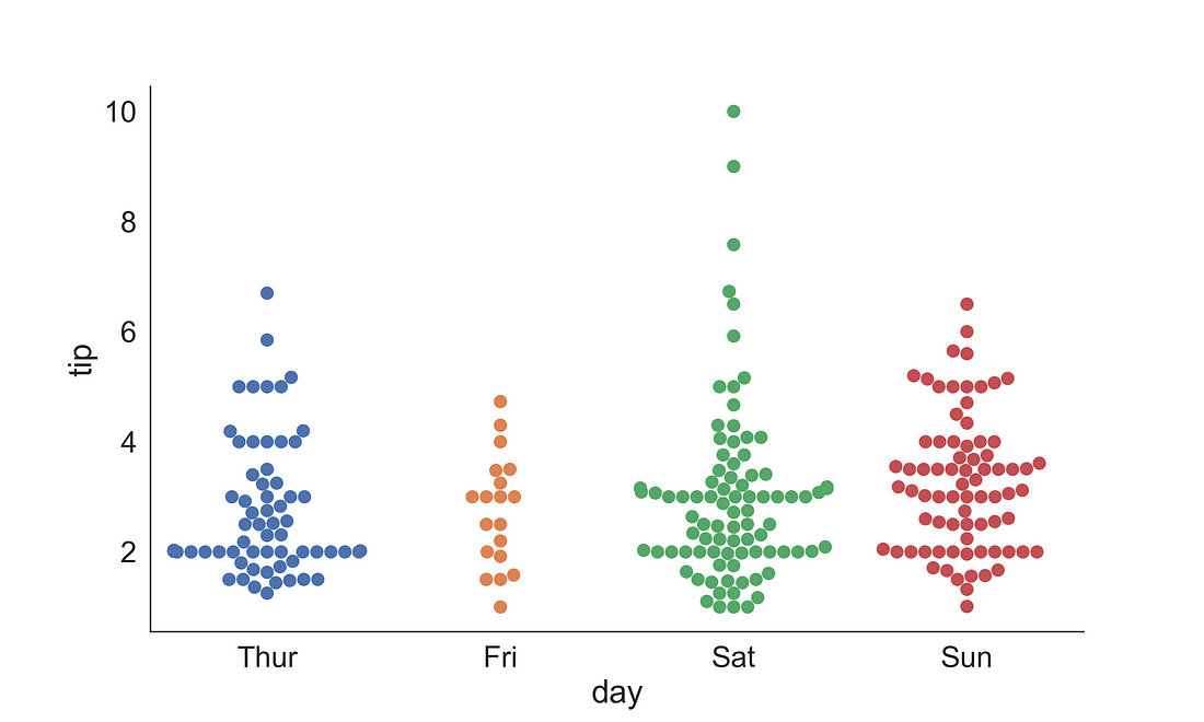
2.2 Plots based on abstract representation
Plots with abstract information include boxplot, violin plot, and boxen (letter value plot)
2.2.1 (a) Boxplot
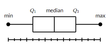
A box and whisker plot (box plot) displays the five-number summary of a set of data. The five-number summary is the minimum, first quartile (Q1), median, third quartile (Q3), and maximum. A vertical line goes through the box at the median. The whiskers go from each quartile to the minimum or maximum.
Let’s observe the median tips for each day by gender. Here, we have supplied the sex variable into hue so that it will plot the box separate for male and female with distinct filled colours.
Note: One thing to note that you can see the legend title is small than the labels. We will fix it in the next plot.
fig, ax = plt.subplots(figsize=(10, 6))
sns.boxplot(x = "day",
            y = "tip",
            data = tips,
            ax = ax,
            hue = "sex")
sns.despine(right = True)
plt.show()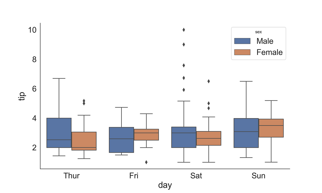
To fix the legend title and to change the legend labels, we could access the legend internals using ax.get_legend_handles_labels() and can save the outputs into handles and labels. To modify the legend we use ax.legend( ), where we supply the handles object and provide new labels string in a list. Additionally, we could increase the font and title font size.
fig, ax = plt.subplots(figsize=(10, 6))
sns.boxplot(x = "day",
              y = "tip",
              data = tips,
              ax = ax,
              hue = "sex")
handles, labels = ax.get_legend_handles_labels()
ax.legend(handles, ["Men", "Woman"], title='Gender', fontsize=16, title_fontsize=20)
sns.despine(right = True)
plt.show()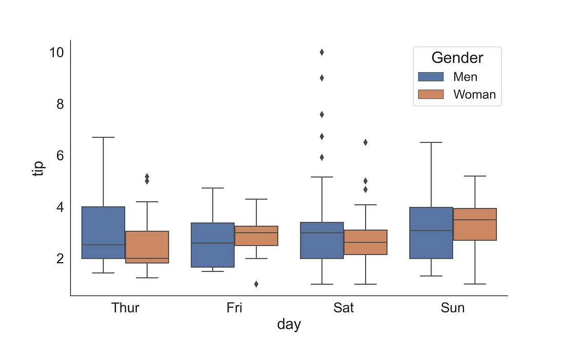
2.2.1 (b) Boxplot + Stripplot
Sometimes we need to display how the data points are distributed. We can achieve this by overlapping a stripplot on a boxplot.
fig, ax = plt.subplots(figsize=(10, 6))
sns.stripplot(x = "day",
              y = "tip",
              hue = "sex",
              data = tips,
              ax = ax,
              dodge=True,
              s = 8,
              marker="D",
              palette="Set2",
              alpha = 0.7)
sns.boxplot(x = "day",
            y = "tip",
            data = tips,
            ax = ax,
            hue = "sex")
handles, labels = ax.get_legend_handles_labels()
ax.legend(handles, ["Men", "Woman"], title='Gender', fontsize=16, title_fontsize=20)
sns.despine(right = True)
plt.show()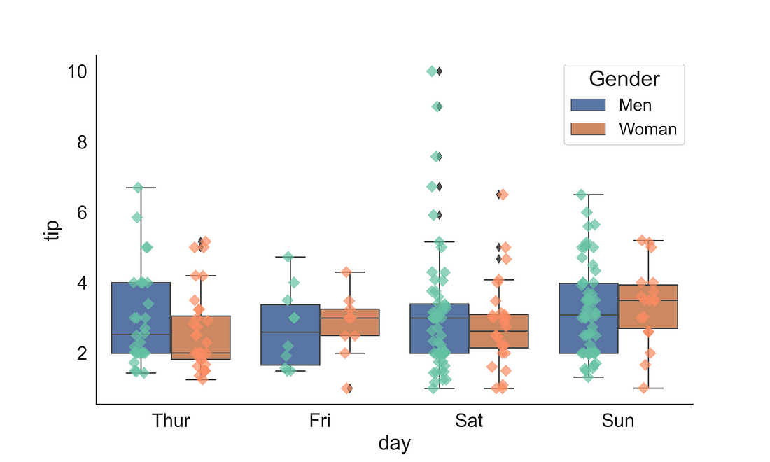
2.2.2 Violin Plot
A violin plot plays a similar role as a box and whisker plot. Unlike a box plot, in the violin plot, it features a kernel density estimation of the underlying distribution across several levels. Here, we have plotted day on the x-axis and tips on the y-axis with hue corresponding to sex using a violin plot.
fig, ax = plt.subplots(figsize=(10, 6))
sns.violinplot(x = "day",
              y = "tip",
              data = tips,
              ax = ax,
              hue = "sex")
handles, labels = ax.get_legend_handles_labels()
ax.legend(title='Gender', fontsize=16, title_fontsize=20)
sns.despine(right = True)
plt.show()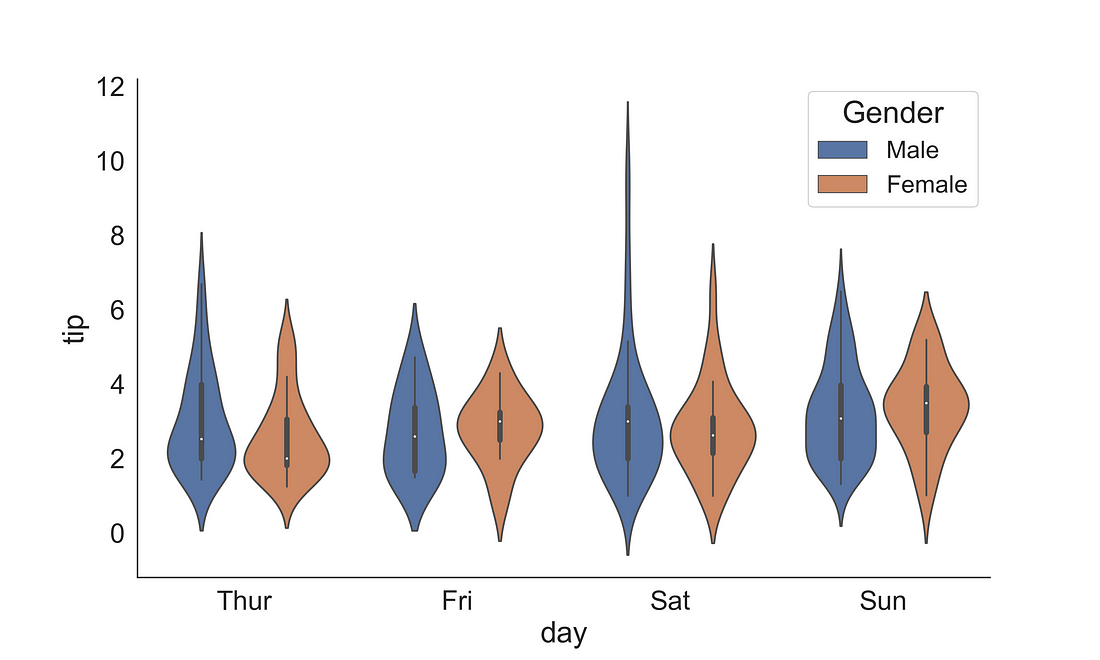
2.2.3 Boxenplot (Letter-value plot)
The Boxenplot is also known as the letter-value plot is introduced by Heike Hofmann, Karen Kafadar and Hadley Wickham.
Article Title: “Letter-value plots: Boxplots for large data”
The letter-value plot covers the following sort comings of box-plot:
(1) it conveys more detailed information in the tails using letter values, but only to the depths where the letter values are reliable estimates of their corresponding quantiles and (2) outliers are labelled as those observations beyond the most extreme letter value.
Read more on that in the article that introduced the plot [Hofmann et al., (2011)]: link
fig, ax = plt.subplots(figsize=(10, 6))
sns.boxenplot(x = "day",
              y = "tip",
              data = tips,
              ax = ax,
              hue = "sex",
              palette="pastel")
handles, labels = ax.get_legend_handles_labels()
ax.legend(title='Gender', fontsize=16, title_fontsize=20)
sns.despine(right = True)
plt.show()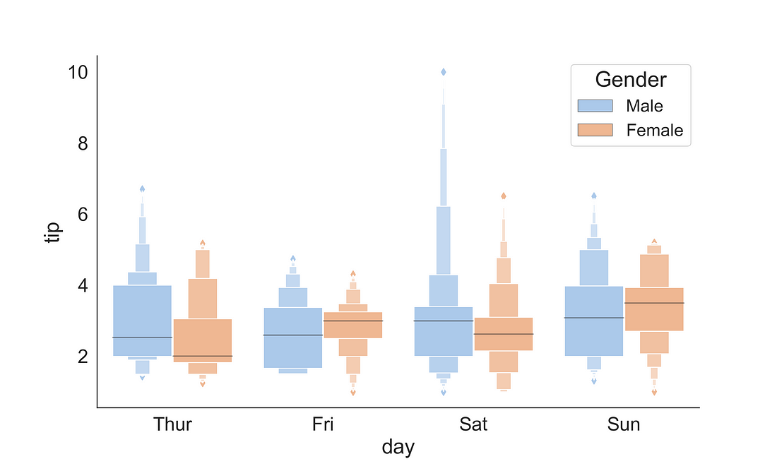
2.3 Plots with Statistical Estimates
2.3.1 Count Plot
seaborn.countplot() method is used to illustrate the counts of observations in each categorical bin using bars.
Let’s visualize how many are smoker and non-smoker across two gender groups in the tips dataset.
fig, ax = plt.subplots(figsize=(10, 6))
sns.countplot(x = "sex",
              data = tips,
              ax = ax,
              hue = "smoker",
              palette="Set1")
handles, labels = ax.get_legend_handles_labels()
ax.legend(handles, ["Yes", "No"], title='Smoker', fontsize=16, title_fontsize=20)
sns.despine(right = True)
plt.show()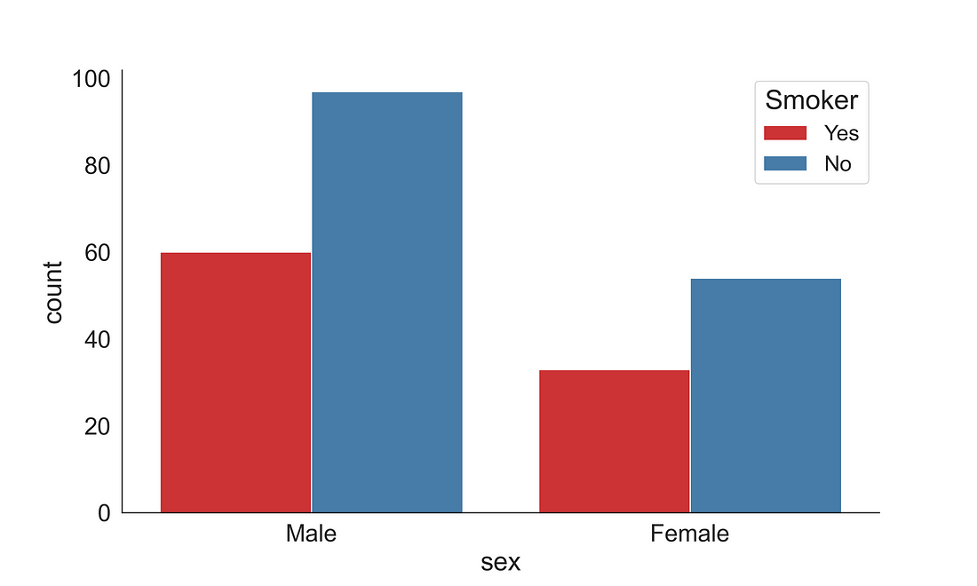
2.3.2 Point plot
Point plots can be more useful than bar plots when one need to compare between different levels of one or more categorical variables. It is particularly helpful when one needs to understand how the levels of one categorical variable changes across levels of a second categorical variable. The lines that join each point from the same hue level allows interactions to be judged by differences in slope. The point plot shows only the mean (or other estimator) value. Here, I have added an error bars cap width of 0.1.
fig, ax = plt.subplots(figsize=(10, 6))
sns.pointplot(x = "day",
              y = "total_bill",
              data = tips,
              ax = ax,
              hue = "sex",
              capsize = .1,
              palette="Set1",
              dodge = 0.2)
handles, labels = ax.get_legend_handles_labels()
ax.legend(handles, ["Men", "Women"], title='Gender', fontsize=16, title_fontsize=20)
sns.despine(right = True)
plt.show()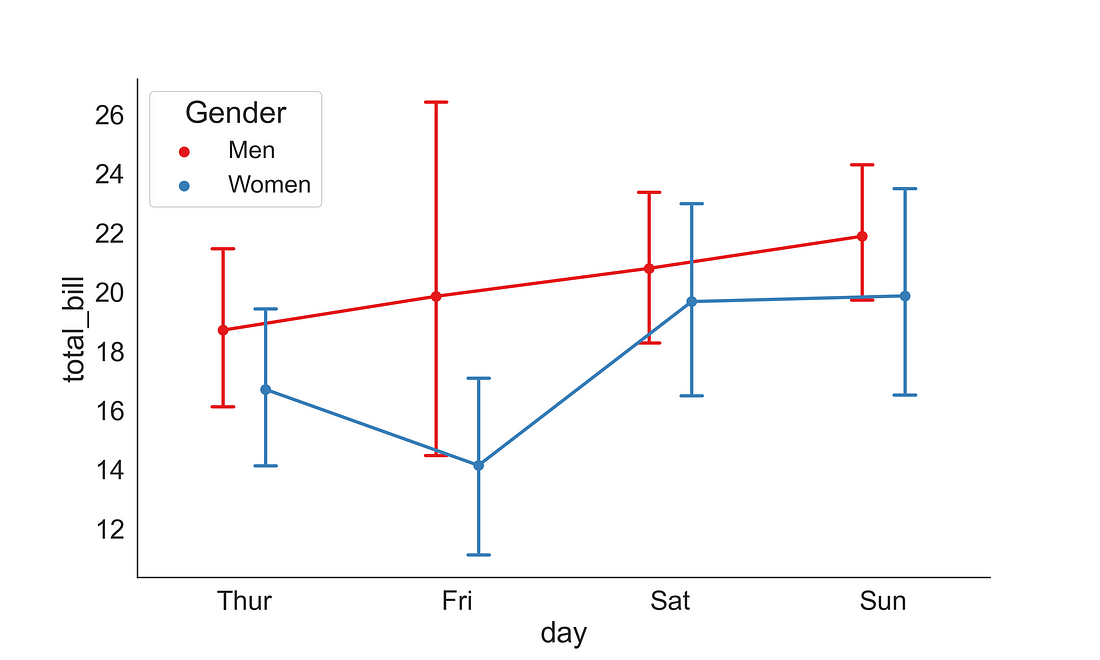
2.3.3 Barplot
A bar plot represents an estimate of central tendency for a numeric variable with the height of each rectangle and provides some indication of the uncertainty around that estimate using error bars. The bar plot shows only the mean (or other estimator) value.
fig, ax = plt.subplots(figsize=(10, 6))
sns.barplot(x = "day",
              y = "tip",
              data = tips,
              ax = ax,
              hue = "sex",
              palette="pastel")
handles, labels = ax.get_legend_handles_labels()
ax.legend(title='Gender', fontsize=16, title_fontsize=20)
sns.despine(right = True)
plt.show()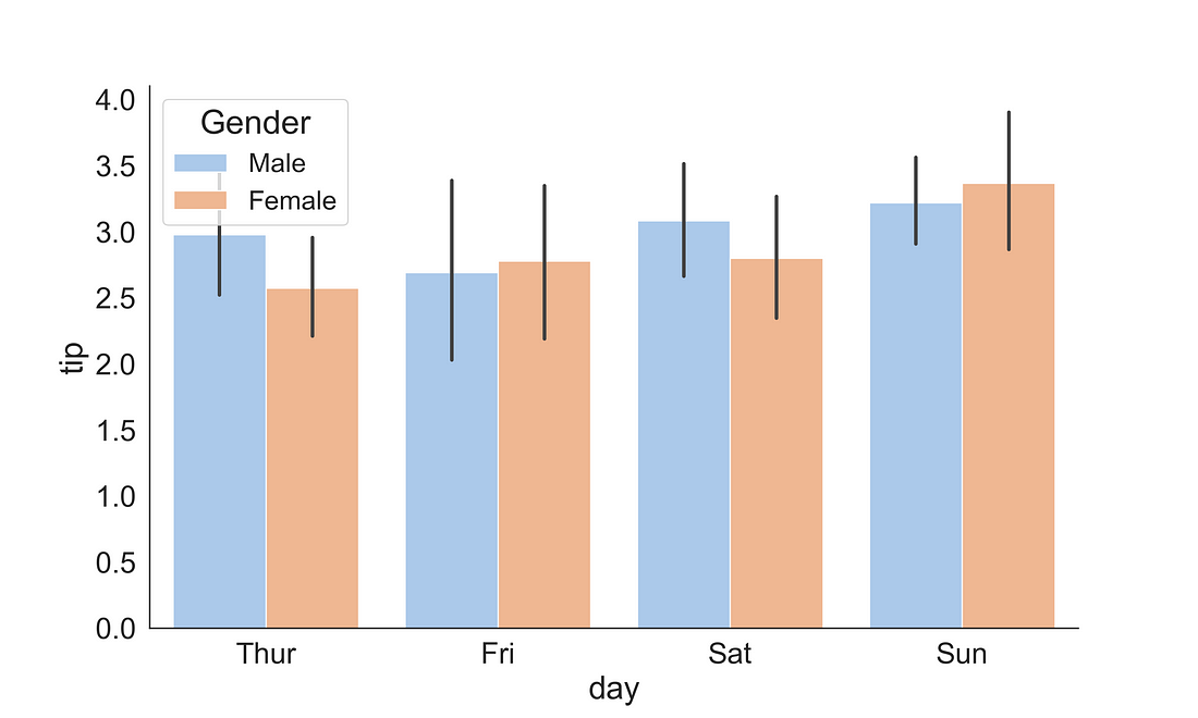
You can also change the estimator to other estimators to represent the bar hight. Here, in the below plot I have included the np.sum as an estimator so that the bar height will represent the sum in each category. To exclude the error bar I have included the ci = None argument.
fig, ax = plt.subplots(figsize=(10, 6))
sns.barplot(x = "day",
              y = "tip",
              data = tips,
              ax = ax,
              hue = "sex",
              palette="pastel",
              estimator = np.sum,
              ci = None)
handles, labels = ax.get_legend_handles_labels()
ax.legend(title='Gender', fontsize=16, title_fontsize=20)
sns.despine(right = True)
plt.show()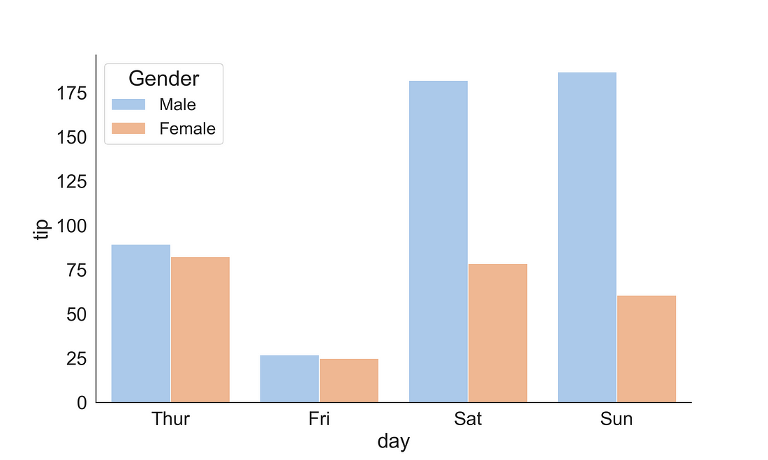
3. Regression Plots
Regression plots are very helpful for illustrating the relationship between two variables. This can be plotted by combining a relational scatterplot and fitting a trend line on that.
3.1 Relational Plot
3.1.1 Scatter Plot
Scatter plot is useful for illustrating the relationship between two continuous variables. To plot a scatterplot we could use the scatterplot( ) function from Seaborn library.
fig, ax = plt.subplots(figsize=(10, 6))
sns.scatterplot(x = "total_bill",
              y = "tip",
              data = tips,
              ax = ax,
              hue = "sex",
              s = 50)
sns.despine(right = True)
plt.show()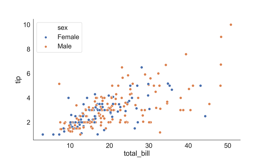
3.2 Regression Plot using regplot( )
A regression plot can be generated using either regplot( ) or lmplot( ). The regplot() performs a simple linear regression model fit while lmplot() combines regplot() and FacetGrid. Inaddition, lmplot( ) offers more customization than the regplot( ).
3.2.1 (a) Linear Regression plot
Here, we want to explore the relationship between the total bill paid and tip. We can plot this by supplying the total bill to x-axis and tip to the y-axis. Here, I have used a diamond marker (“D”) to present the point shape and coloured the points to blue. The trend line (regression line) shows a positive relationship between the total bill and tips.
fig, ax = plt.subplots(figsize=(10, 6))
sns.regplot(x='total_bill',
            y="tip",
            data=tips,
            marker='D',
            color='blue')
sns.despine(right = True)
plt.show()
plt.clf()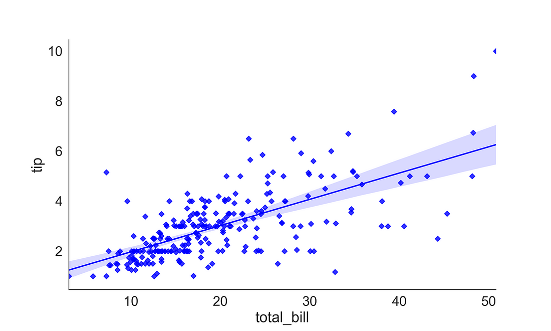
3.2.1 (b) Adding the Regression Equation
In some case, especially for publication, or presentation, you may want to include the regression equation inside the plot. The regplot( ) or lmplot( ) does not offer this functionality yet. But externally we can compute the regression slope and intercept and supply to the plot object. Here, I have used the scipy package to estimate the regression slope and intercept and added to the plot using line_kws argument.
from scipy import stats

fig, ax = plt.subplots(figsize=(10, 6))

# get coeffs of linear fit
slope, intercept, r_value, p_value, std_err = stats.linregress(tips['total_bill'], tips['tip'])
sns.regplot(x='total_bill',
            y="tip",
            data=tips,
            marker='D',
            color='blue',
            line_kws={'label':"tip = {0:.2f} + {1:.2f} * total_bill".format(intercept, slope)})
sns.despine(right = True)

# Add legend
ax.legend(fontsize=16)
plt.show()
plt.clf()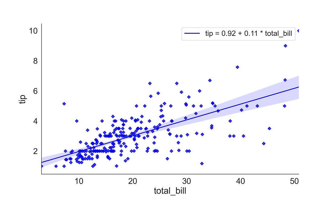
3.2.2 residplot
The residplot helps you visualize the regression residuals which also provide the validity of one of the regression’s core assumptions. The residuals should not be either systematically high or low. In the OLS context, random errors are assumed to produce residuals that are normally distributed. Therefore, the residuals should fall in a symmetrical pattern and have a constant spread throughout the range.
fig, ax = plt.subplots(figsize=(10, 6))
sns.residplot(x = 'total_bill',
            y="tip",
            data=tips,
            color='blue')
sns.despine(right = True)
plt.show()
plt.clf()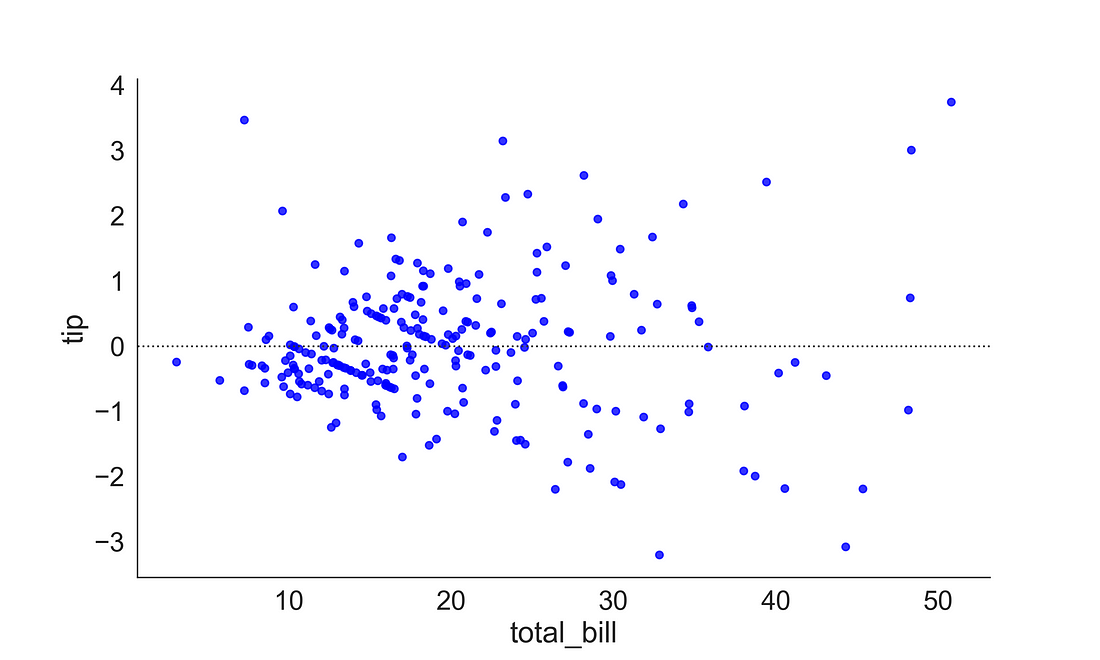
3.2.3 Non-Linear Regression Plot
In the above examples, we showed a relationship that is linear. There might be situations when the relationship between variables is non-linear. Here, to illustrate this example, we will be using the auto-mpg dataset from UCI repository.
auto = pd.read_csv("auto-mpg.csv")
auto.head()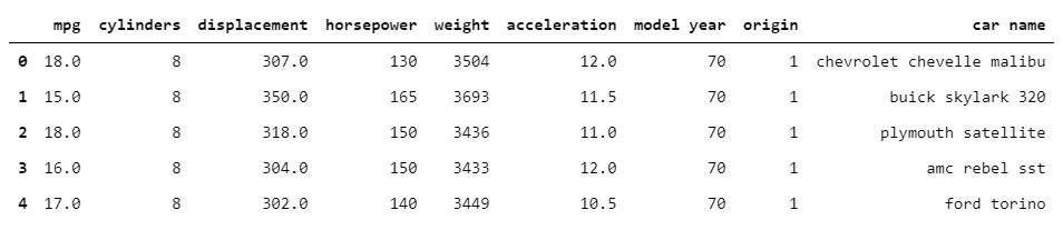
Here, if we plot the relationship between weight (weight of the vehicle) and mpg (miles per gallons), we can observe the relationship is non-linear. In such cases, a non-linear fit could be much appropriate. So to plot the non-linear relationship you can increase the order argument value from 1 (default) to 2 or more.
Here, we first plotted a scatterplot, then overlayed a linear regression line and over that a regression line of order 2. You could see that the regression line of order 2 provides a better fit to the non-linear trend.
fig, ax = plt.subplots(figsize=(12, 8))

# Generate a scatter plot of 'weight' and 'mpg' using skyblue circles
sns.scatterplot(auto['weight'],
                auto['mpg'],
                label='data points',
                s = 50,
                color='skyblue',
                marker='o',
                ax = ax)

# Plot a blue linear regression line of order 1 between 'weight' and 'mpg'
sns.regplot(x='weight',
            y='mpg',
            data=auto,
            scatter=None,
            color='blue',
            label='order 1')

# Plot a red regression line of order 2 between 'weight' and 'mpg'
sns.regplot(x='weight',
            y='mpg',
            data=auto,
            scatter=None,
            order=2,
            color='red',
            label='order 2',
            ax = ax)
sns.despine(right = True)

# Add a legend and display the plot
plt.legend(loc='upper right')
plt.show()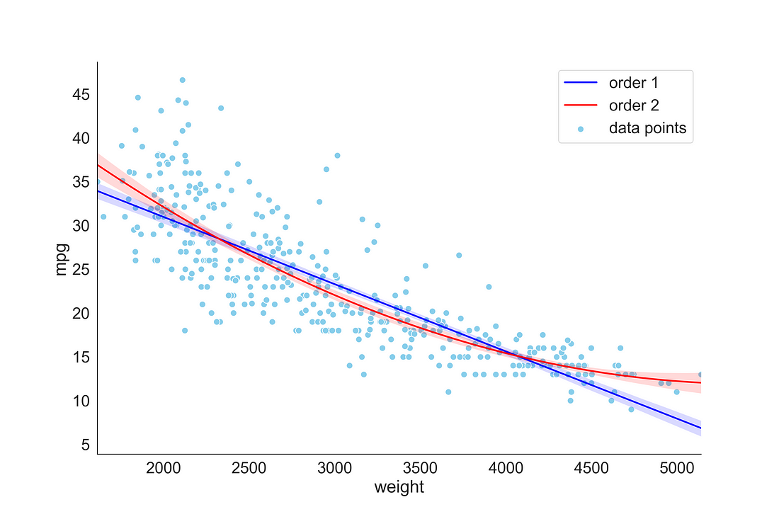
3.3 Rgeression Plot using lmplot( )
lmplot provides more flexibility in generating regression plots. You can supply a categorical variable in hue argument to plot trend line based on the categories. Here, we provided sex into hue argument so that it plots two separate regression line based on the gender category. I also changed the default colour using palette argument.
# Create a regression plot with categorical variable
sns.lmplot(x='total_bill',
            y="tip",
            data=tips,
            hue='sex',
            markers=["o", "x"],
            palette=dict(Male="blue", Female="red"),
            size=7,
            legend=None)
plt.legend(title='Gender', loc='upper left', labels=['Male', 'Female'], title_fontsize = 20)
sns.despine(right = True)
plt.show()
plt.clf()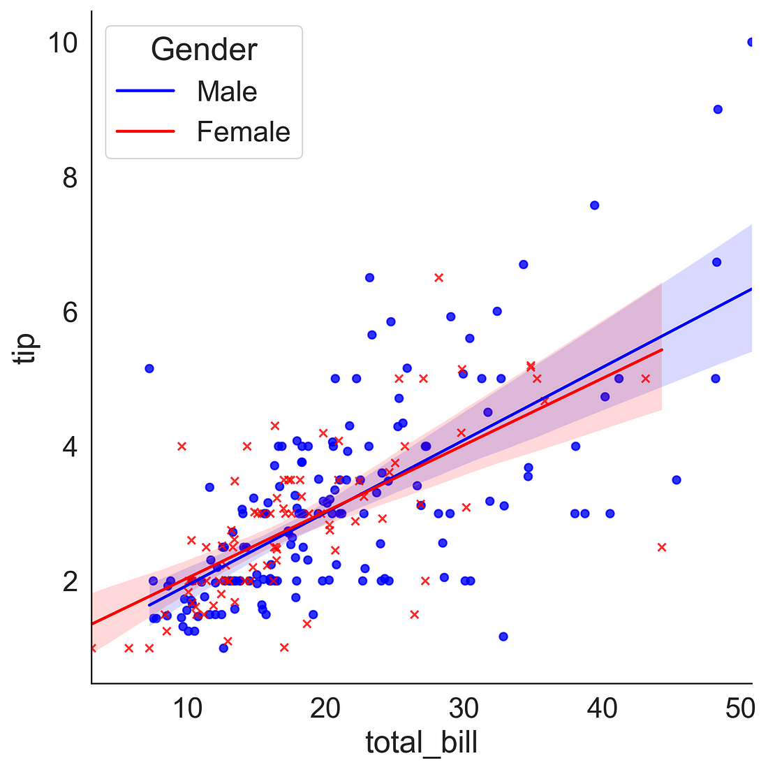
3.4 Logistic Regression Plot
Let’s plot a binary logistic regression plot. For this, we need a discrete binary variable. Let’s assume that tip amount> 3 dollars is a big tip (1) and tip amount≤ 3 is a small tip (0). We can use numpy libraries np.where( ) function to create a new binary column “big_tip”. Now we can fit a binary logistic regression using lmplot( ) by supplying the logistic = True argument.
tips["big_tip"] = np.where(tips.tip > 3, 1, 0)
ax = sns.lmplot(x="total_bill", y="big_tip", data=tips,
                 logistic=True, n_boot=500, y_jitter=.03, aspect = 1.2)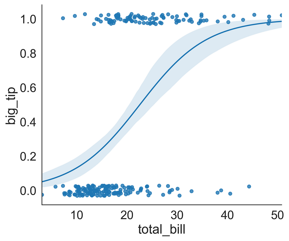
4. Time Series Plots
Though seaborn package can be used to plot time series data. Though I prefer Matplotlib for time series plotting as it is very convenient to use. One could directly supply date as index column into plots.
Here, we are going to use the sales dataset, which contains sales date, sales value, ads budget and GDP.
sales_data = pd.read_csv("Sales_dataset.csv", parse_dates=True, index_col = 0)
sales_data.head()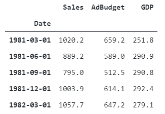
One of the best ways of plotting time series is to make a convenient function. Here I have created a function that takes axes, x, y, color, xlabel and ylabel arguments.
Step1: we use ax.plot( ) to generate a line plot and also supply a line color
Step2: we set the xlabel and ylabel using ax.set( )
Step3: setting the y-tick parameter color
# Define a function called timeseries_plot
def timeseries_plot(axes, x, y, color, xlabel, ylabel):

  # Plot the inputs x, y in the provided color
  axes.plot(x, y, color=color)

  # Set the x-axis label
  axes.set_xlabel(xlabel)

  # Set the y-axis label
  axes.set_ylabel(ylabel, color=color)

  # Set the colors tick params for y-axis
  axes.tick_params('y', colors=color)
Let’s plot the sales values based on dates
# Define style
sns.set_style('white')
sns.set_context("paper", font_scale = 2)

# setting figure and axis objects
fig, ax = plt.subplots(figsize = (12, 8))

# Plotting sales values
timeseries_plot(ax, sales_data.index, sales_data["Sales"], "blue", "Time (years)", "Sales")

sns.despine(right = True)
plt.show()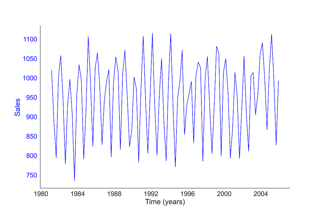
We can plot two variables together with a common x-axis. Here, I have plotted sales and GDP using a common x-axis [by setting ax.twinx( ) ] and left y-axes used for presenting sales and right y-axis used for presenting GDP.
# Defining style
sns.set_style('white')
sns.set_context("paper", font_scale = 2)

# Create figure and axes object and set the figure size
fig, ax = plt.subplots(figsize = (12, 8))

# Add first time series based on Sales
timeseries_plot(ax, sales_data.index, sales_data["Sales"], "blue", "Time (years)", "Sales")

# Create a twin Axes that share the x
ax2 = ax.twinx()

# Add second time series based on GDP
timeseries_plot(ax2, sales_data.index, sales_data["GDP"], "red", "Time (years)", "GDP")
plt.show()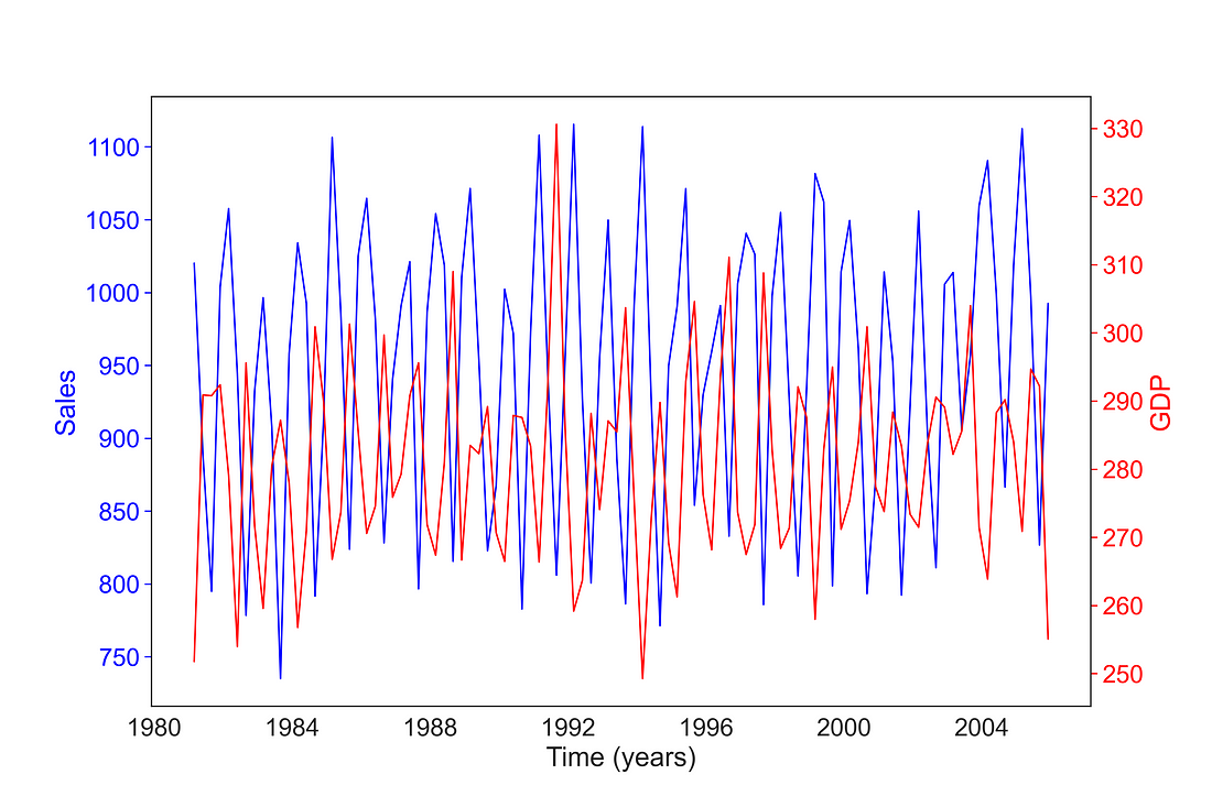
5. Heat Maps
Sometimes we need to plot rectangular data as a colour-encoded matrix to visualize patterns in a dataset. Heat maps come as a handy tool in such circumstances. But Seaborn’s heatmap only takes data in matrix form. So, first, you need to prepare a matrix that you want to supply in a heatmap. Panda’s crosstab( ) function is one of the best tools for this job.
Let’s see mean tips given by male and female over different days. Here, in the crosstab, I’m using a mean aggregate function for calculating mean tips over different days given by male and female.
crosstab1 = pd.crosstab(index=tips['day'],
                        columns=tips['sex'],
                        values=tips['tip'],
                        aggfunc='mean')
crosstab1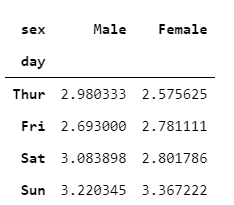
In addition to highlighting the values with colour using the heatmap( ) function, we could add a text annotation and colour bar by supplying annot = True and cbar = True. Here, I have opted for a “Reds” colour palette with 8 discrete colour mapping. For convenience, I have rotated the x-tick labels to 90 degrees.
You can observe that the highest average tip was given by females on Sunday.
fig, ax = plt.subplots(figsize=(10, 6))
sns.heatmap(crosstab1,
            annot = True,
            cbar = True,
            cmap = sns.color_palette("Reds", 8),
            linewidths=0.3,
            ax = ax)
# Rotate tick marks for visibility
plt.yticks(rotation=0)
plt.xticks(rotation=90)
#Show the plot
plt.show()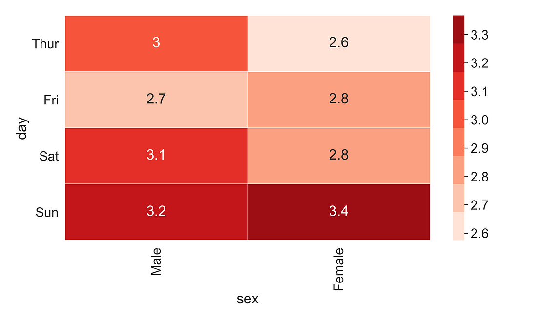
Matplotlib and Seaborn are really awesome plotting libraries. I would like to thank all the contributors of Matplotlib and Seasborn library.
I hope you learned something new!
Code and dataset Link