Rahul Raoniar
- posted on
- Comments Off on Generate Publication Ready Facet, Pair, and Joint Plots using Seaborn Library (Part 2)

The visualization is an important part of any data analysis. This helps us present the data in pictorial or graphical format. Data visualization helps in
- Grasp information quickly
- Understand emerging trends
- Understand relationships and pattern
- Communicate stories to the audience
I work in the transportation domain, thus I’m fortunate that I get to work with lots of data. In the data analysis part of the task, I have to often perform exploratory analysis. When comes to visualization my all-time favourite is the ggplot2 library (R’s plotting library: R is a statistical programming language) which is one of the popular plotting tools. Recently, I also started implementing the same using python due to recent advancements in python libraries. I have observed a significant improvement in python data analysis tools specifically, data manipulation, plotting and machine learning. So, I thought let’s see whether python visualization tools offer similar flexibility or not, like what ggplot2 does. So, I tried several libraries like Matplotlib, Seaborn, Bokeh and Plotly. As per my experience, we could utilize seaborn (static plots) and Plotly (interactive plots) for the majority of exploratory analysis tasks with very few lines of codes and avoiding complexity.
After going through different plotting tools, especially in Python, I have observed that still there are challenges one would face while implementing plots using the Matplotlib and Seaborn library. Especially, when you want it to be publication-ready. During learning, I have gone through these ups and downs. So, let me share my experience here.
The Seaborn library is built on top of the Matplotlib library and also combined with the data structures from pandas. The Seaborn blog series comprised of the following five parts:
Part-1. Generating different types of plots using seaborn
Part-2. Facet, Pair and Joint plots using seaborn
Part-3. Seaborn’s style guide and colour palettes
Part-4. Seaborn plot modifications (legend, tick, and axis labels etc.)
Part-5. Plot saving and miscellaneous
** In this article, we will explore and learn to generate Facet, Pair and Joint plots using matplotlib and seaborn library.
The article comprises of the following:
- Loading libraries
- Loading relevant datasets
- FacetGrid( ) → Wrapper functions [relplot, catplot and lmplot]
- PairGrid( ) → Wrapper function [pairplot]
- JointGrid() → Wrapper function [jointplot]
- Code and dataset link
Loading Libraries
The first step is to load relevant plotting libraries.
import pandas as pd               # data loading and manipulation
import matplotlib.pyplot as plt   # plotting
import seaborn as sns             # statistical plotting
from palmerpenguins import load_penguins   # Penguin dataset
Setting style and context
Seaborn offers five preset seaborn themes: darkgrid, whitegrid, dark, white, and ticks. The default theme is darkgrid. Here we will set the white theme to make the plots aesthetically beautiful.
Plot elements can be scaled using set_context( ). The four preset contexts, in order of relative size, are paper, notebook, talkand poster. The notebook style is the default. Here we are going to set it to paper and scale the font elements to 2.
sns.set_style('white')
sns.set_context("paper", font_scale = 2)
About datasets
In this blog, we primarily going to use the Tips dataset. The data was reported in a collection of case studies for business statistics. The dataset is also available through the Python package Seaborn.
Source:
Bryant, P. G. and Smith, M. A. (1995), Practical Data Analysis: Case Studies in Business Statistics, Richard D. Irwin Publishing, Homewood, IL.
The Tips data contains 244 observations and 7 variables (excluding the index). The variables descriptions are as follows:
bill: Total bill (cost of the meal), including tax, in US dollars
tip: Tip (gratuity) in US dollars
sex: Sex of person paying for the meal (Male, Female)
smoker: Presence of smoker in a party? (No, Yes)
weekday: day of the week (Saturday, Sunday, Thursday and Friday)
time: time of day (Dinner/Lunch)
size: the size of the party
# Load tips data from seaborn libraries
tips = sns.load_dataset("tips")
print(tips.head())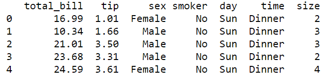
In addition to tips datasets, we are going to use a second dataset named “Penguins” for making few plots. The Penguins dataset contains 343 observations and 8 variables (excluding the index). The Penguins dataset comprised of the following variable:
species: a factor denoting penguin species (Adélie, Chinstrap and Gentoo)
island: a factor denoting island in Palmer Archipelago, Antarctica (Biscoe, Dream or Torgersen)
bill_length_mm: a number denoting bill length (millimeters)
bill_depth_mm: a number denoting bill depth (millimeters)
flipper_length_mm: an integer denoting flipper length (millimeters)
body_mass_g: an integer denoting body mass (grams)
sex: a factor denoting penguin sex (female, male)
year: an integer denoting the year of observation
One can load the penguins datasets by calling the load_penguins( ) function. The dataset contains few missing values thus we can omit those missing values by calling a .dropna( ) method.
# Load penguins dataset and remove na values
penguins = load_penguins()
penguins = penguins.dropna()
print(penguins.head())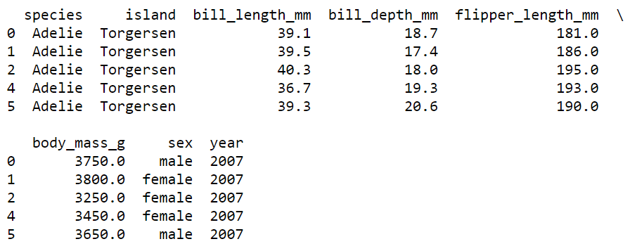
Let’s start with different facet plots one by one.
1. FacetGrid
FacetGrid helps in visualizing the distribution of one variable as well as the relationship between multiple variables separately within subsets of your dataset using multiple panels. A FacetGrid can be drawn with up to three dimensions by specifying a row, column, and hue.
The FacetGrid( ) function is useful when we want to plot a subset of data based on a categorical column, say for the tips dataset you want to see how the tip varies with the total bill amount but separately for each day. You can plot a subset of the data based on a categorical column by supplying it to column (col) or (row) argument.
The plotting mechanism is simple.
Step1: supply the data and categorical column to col or row arguments and create a facet grid plot object (here, g1).
Step2: apply a seaborn’s plot function using .map( ) method and supply x-axis and y-axis variables (columns).
Here, in the FacetGrid( ) I have faceted the plot based on the “day” variable column-wise. Next, supplied the seaborn’s scatterplot function through .map( ) method.
Step3: Plotting the final object using plt.show( ) function.
g1 = sns.FacetGrid(data = tips,
                   col = "day",
                   row_order = ["Sat", "Sun", "Thur", "Fri"])

g1.map(sns.scatterplot,
       "total_bill",
       "tip")

plt.show()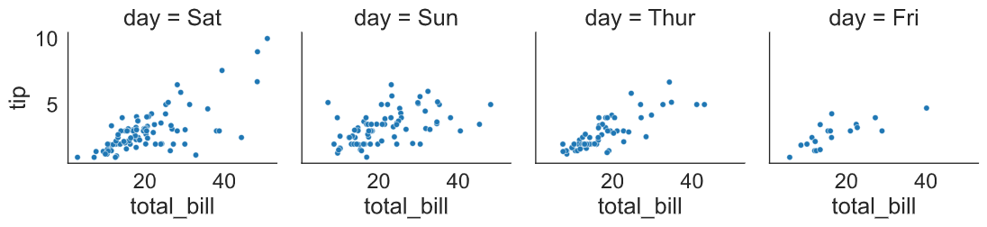
FacetGrid( ) offers a lot of detailed functionality. For fast visualization, we can create similar plot using two different functions relplot( ) and catplot( ).
1.1 Relational plot
The relplot( ) is used to plot relations especially when we want to observe the relationship between two continuous variables. For example, a relational plot could be a scatter plot.
Here, we used the relplot( ) function where we supplied two continuous variables on the x-axis and y-axis, followed by a dataset. Next, we supplied “scatter” in the “kind” argument as we want to generate a scatterplot. Next, we supplied the “day” variable in the column (col) argument, so that it plots different relational plots (scatterplots) based on the day-wise subset of data.
sns.relplot(x = "total_bill",
            y = "tip",
            data = tips,
            kind = "scatter",
            col = "day")
plt.show()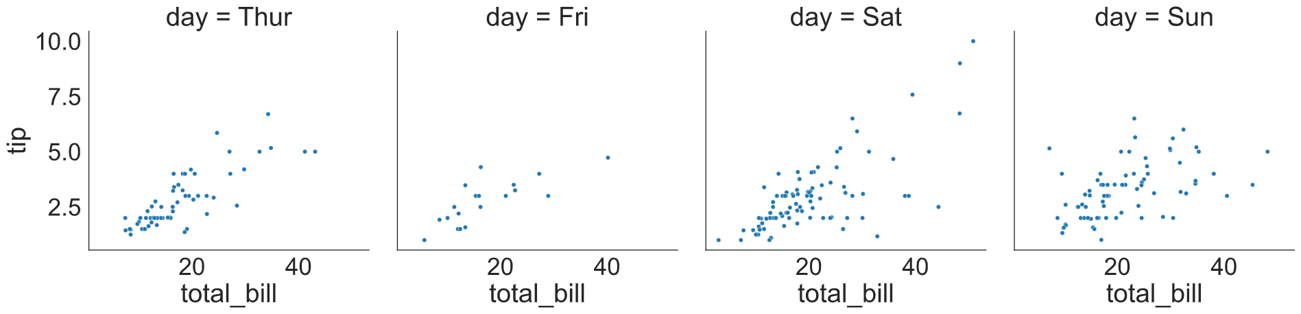
1.2 Categorical Plot
Catplot( ) is another alternative but very useful when you are dealing with a categorical column. You can generate a count plot, bar plot, box plot and violin plot using the catplot function. The best part is that you can subset data by supplying a categorical column to row and column (col) parameters as arguments.
For, example here I have plotted the distribution (densities) of tips across gender over different days.
sns.catplot(x = "sex",
            y = "tip",
            data = tips,
            kind = "violin",
            col = "day")
plt.show()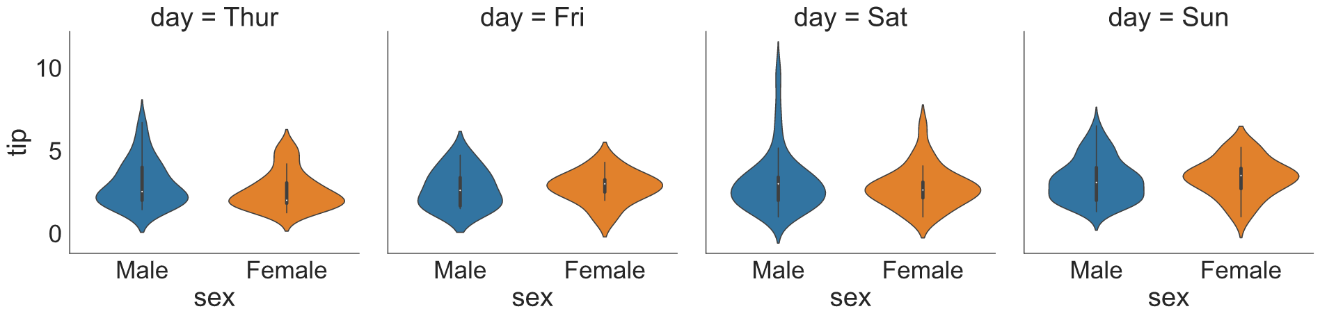
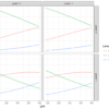
1.3 lmplot()
lmplot( ) is useful when we want to generate regression plots. The function has lots of features that make your regression visualization very easy and fun.
Here, we have generated a scatter plot with the best fit line between total_bill and tip. Next, we subsetted the plot across row and column based on sex and time variables. Next, we supplied “day” into hue to generate separate regression best fit lines for each category. Additionally, you can change the row or column order too.
col_order = ['Lunch','Dinner']
sns.lmplot(x = 'total_bill',
           y = 'tip',
           data = tips,
           col = "time",
           row = 'sex',
           row_order = ["Male", "Female"],
           hue = 'day',
           col_order = col_order)
plt.show()
plt.clf()
2. PairGrid
Seaborn’s PairGrid( ) function could be used for plotting pairwise relationships of variables in a dataset. This type of plot is very useful when we want to see the relationship between multiple variables as well as their distribution in one plot.
The pairgrid( ) plot generation requires the following steps:
- First, you need to generate a PairGrid( ) plotting object. Here, we have used the penguin dataset and supplied four features for pair-wise plotting.
- Next, supply a plotting function for the diagonal section using map_diag( ) function. Here we have plotted histograms for the diagonal section
- Finally, supply another plot function for the off-diagonal grids using map_offdiag( ). Here we have supplied plt.scatter to generate pairwise scatterplots for off-diagonal grids.
g = sns.PairGrid(penguins,
                  vars=['bill_length_mm', 'bill_depth_mm',
                       'flipper_length_mm', 'body_mass_g'])
g2 = g.map_diag(plt.hist)
g3 = g2.map_offdiag(plt.scatter)
plt.show()
2.1 Pair Plots
The pairplot is a convenience wrapper around many of the PairGrid functions. The .pairplot( ) is the quick plotting function that helps in generating PairGrid like plots for quick exploratory analysis.
This plotting function offers almost similar parameters. Here, the type of off-diagonal and diagonal plots are decided by supplying a plot function into the “kind” and diag_kind arguments respectively. You can also set colour palettes and use **kws arguments to supply additional details.
sns.pairplot(vars = ['bill_length_mm', 'bill_depth_mm',
                       'flipper_length_mm', 'body_mass_g'],
             data = penguins,
             kind = 'scatter',
             diag_kind = "hist",
             hue = 'species',
             palette = "Set1",
             diag_kws = {'alpha':.5})
plt.show()
plt.clf()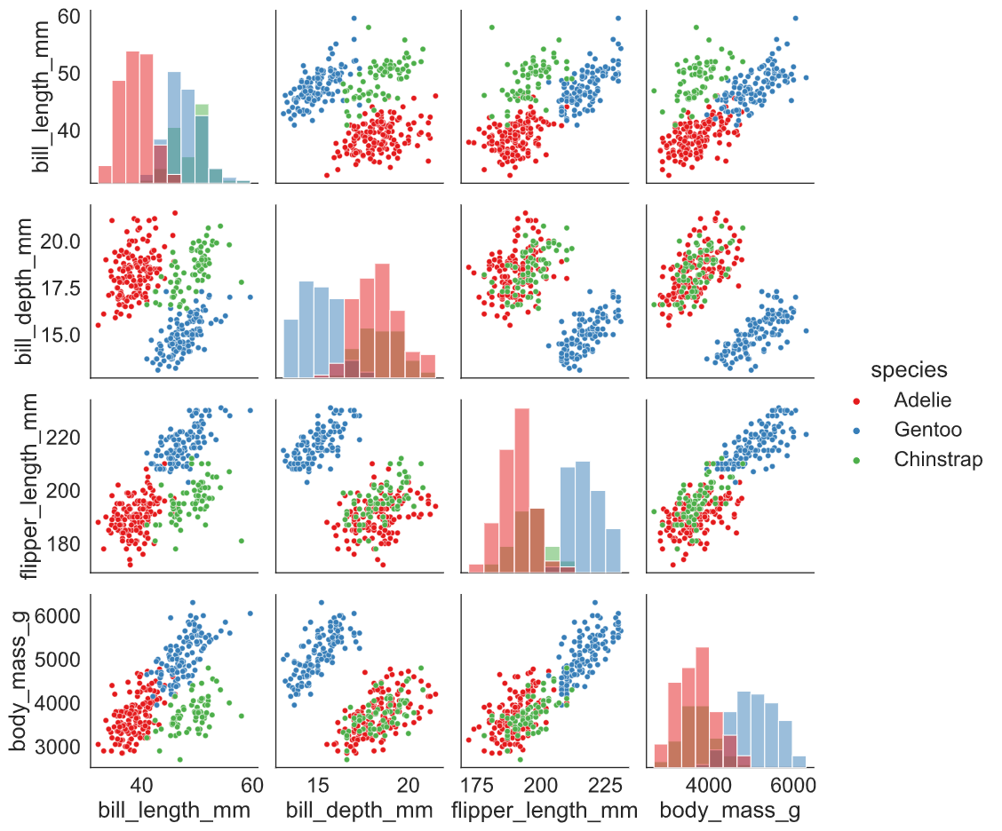
Here, is another example of pairplot( ), where we have supplied a categorical column (Species) to hue and asked seaborn to fit regression line (kind: reg). Additionally, added Kernel Density Estimate (KDE) plots across the grid’s diagonal line.
sns.pairplot(vars = ['bill_length_mm', 'bill_depth_mm',
                       'flipper_length_mm', 'body_mass_g'],
             data = penguins,
             kind = 'reg',
             diag_kind = "kde",
             hue = 'species',
             palette = "Set1",
             diag_kws = {'alpha': 0.4})
plt.show()
plt.clf()
3. JointGrid()
Seaborn’s JointGrid combines univariate plots such as histograms, rug plots and kde plots with bivariate plots such as scatter and regression plots.
Let’s assume that we want to plot a bivariate plot (total_bill vs tip) and also want to plot a univariate distribution (histogram) for each variable. The plot generation comprised of the following steps:
Step1: The first step is to create a JointGrid( ) object by supplying the x-axis, y-axis variables and dataset.
Step2: Next, supply the plotting functions through a .plot( ) function. The first argument is for the bivariate plot and the second argument is for the univariate plot.
sns.set_style("whitegrid")
g = sns.JointGrid(x="total_bill",
                  y="tip",
                  data = tips)
g.plot(sns.regplot, sns.histplot)
plt.show()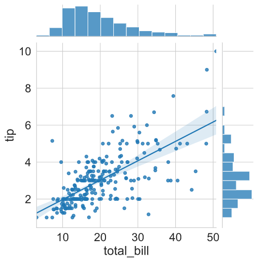
3.1 jointplot( )
The jointplot is a convenience wrapper around many of the JointGrid functions. It isa quick plotting function used for fast exploratory analysis. Here, we have reproduced the same plot (as discussed above) by just supplying a “reg” (regression) argument to kind parameter.
sns.jointplot(x = "total_bill",
              y = "tip",
              kind = 'reg',
              data = tips)
plt.show()
plt.clf()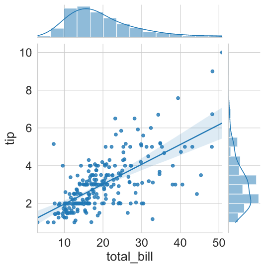
Here is an example of a residual plot generated by supplying the “resid” argument to the kind parameter.
sns.jointplot(x = "total_bill",
              y = "tip",
              kind = 'resid',
              data = tips)
plt.show()
plt.clf()
We can plot more sophisticated plots using jointplot( ) parameters. Even it is possible to overlay some of the JointGrid plots on top of the standard jointplot.
In the following example, we have supplied the bins argument for the histogram using marginal_kws parameter. Additionally, we added a kdeplot using the plot_join( ) method.
g = (sns.jointplot(x = "total_bill",
                  y = "tip",
                  kind = 'scatter',
                  data = tips,
                  marginal_kws = {"bins": 20}).plot_joint(sns.kdeplot))
plt.show()
plt.clf()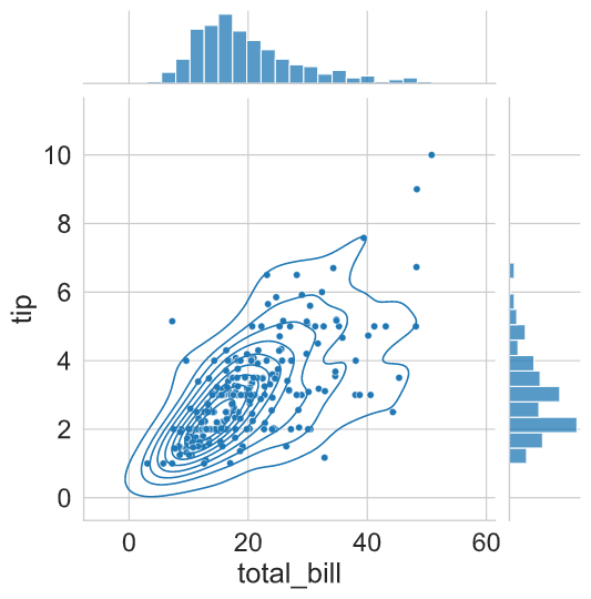
Matplotlib and Seaborn are really awesome plotting libraries. I would like to thank all the contributors for contributing to Matplotlib and Seaborn libraries.
I hope you learned something new!
Code and dataset Link
If you learned something new and liked this article, share it with your friends and colleagues. If you have any suggestions, drop a comment.
Featured image by Gerd Altmann from Pixabay